
One Open-source Project Daily
Free monospaced font with programming ligatures
https://github.com/tonsky/FiraCode
#1ospd #opensource #font #ligatures #programmingligatures
#ligatures

Last but not least, some of the most extravagant #alternate shapes and #ligatures contained in the Luperca typeface aren't novelties, they're rather ancient shapes gathered from a variety of inscriptional sources, mainly intended to save #writing space. Sometimes, to find something new, you just have to look at the forgotten traces of the past. I hope that you liked this presentation! (6/6)

#Epstein #Death Scene CBS News’s #forensic review underscores same pattern: no #evidence markers no #fingerprint or #DNA work, multiple #ligatures photographed in different places, safe w labeled CDs documented but not seized, later missing minutes from surveillance footage. Agents arrived hrs late; core #witnesses weren’t interviewed for two years. Those are not innocent mistakes; they R protective failures. Release #epsteinfiles100,000 docs, photos, videos evidence #FBI has since 2019 #coverup

psudoFont Liga Mono: phông chữ ligatures dành cho lập trình! 📝 Tạo ra từ sự kết hợp Menlo/Meslo và IBM Plex Mono/Lilex. Ligatures giúp code dễ đọc hơn. Tác giả đã phải học chỉnh sửa glyph và thiết kế lại 3 lần để hoàn thiện. #ProgrammingFont #Ligatures #FontDesign #psudoFont #PhongChuLapTrinh #ThietKeFont
https://www.reddit.com/r/programming/comments/1nxc39i/psudofont_liga_mono_a_programming_font_with/

Checking how many ligatures i can find.
#pitture #mural #murale #chrch #art #greece #piraeus #solon #church #orthodox #orthodoxchurch #greekorthodox #ligatures #greekligatures #picture
#pitture #mural #murale #chrch #art #greece #piraeus #solon #church #orthodox #orthodoxchurch #greekorthodox #ligatures #greekligatures #picture


It's late 2025, does any #Gnome or #Gtk #terminal application support #font #ligatures?
Currently I tend to use #qterminal. Not I'll try #wezterm

What would be the correct way to handle discretionary ligatures inside Glyphs (especially for arrow symbols)?
I'm currently doing it like this, while also having the original arrow symbols inside the typeface.


Playing around with arrow ligatures in Arcticons Sans.

I'm so used to four space indents, that when I have to use two spaces I still want to *view* the code as four space indented. (There is one extension for VSCode but it is very yanky.)
Now I'm thinking, could I modify the font to render two spaces " " with ligatures as longer to appear as if it's four spaces? It would work pretty much always, no yank?

I had a short talk with @rainerklute about how to use #OpenType #ligatures in an icon font for screen reader #accessibility in PDFs.
Video in German here:
https://www.youtube.com/watch?v=zC9BvE8JoRs

You can't get mad a chat gpt.
https://vps111.heliohost.us/temp
that's pretty cool of him. but how does that help me with the CSS?
He so desperately wants me to adapt to using the #ligatures approach

Here's how to use a ligature font in Illustrator and InDesign https://youtu.be/copVHXKfQ8s #tutorial #illustrator #indesign #grep #ligatures #design #vector

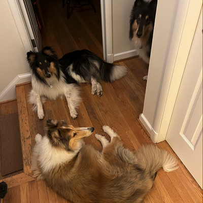
Large is a transitional serif #typeface designed by Alexandre Créquer, a #type designer based in Rennes. Defined by ample width, soft corners and a large set of stylish #ligatures, it is available in two styles, Roman and Italic.
Students interested in purchasing the #Large typeface receive an 80% discount, while non-profit organizations are eligible for a 50% discount.
https://alex-creq.com/typefaces/large
#typefacedesign #fontdesign #typefaces #typedesign #typography #alexandrecrequer #certainmagazine

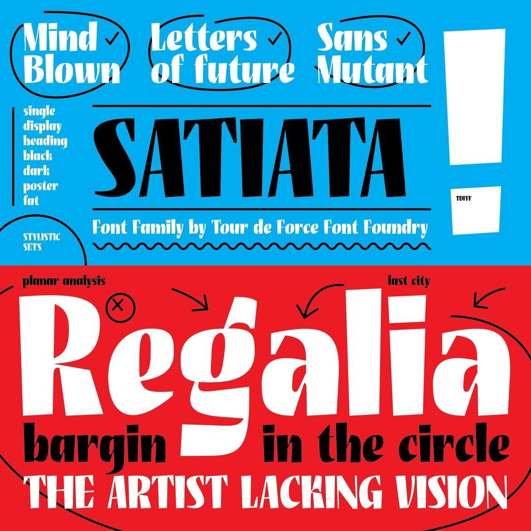
Satiata is a bold, single-weight display #font designed by Dušan Jelesijević and released by Tour de Force Font Foundry in 2022.
Its condensed proportions make it ideal for posters, titles, outdoor graphics, packaging, branding and websites. It includes an extended Latin character set, two stylistic sets and #ligatures.
Satiata is currently available for purchase through #Fontspring and #MyFonts

Reason \((S n)\) as to why I am not fond of #programming #font #ligatures:
+ \(\in\)
+ \(\notin\)
Look the same for me at my usual font size...
#Dafny mode for emacs uses a 'pretty mode' by default (Boo!), worse is that the option is not customisable (BOO!).
```{.elisp}
(defun no-prettification-in-dafny-mode ()
(prettify-symbols-mode -1))
(add-hook 'dafny-mode-hook #'no-prettification-in-dafny-mode)
```

Does anybody know a proportional font which has coding ligatures, e.g. `->` becomes a right arrow?
There are many mono-spaced fonts with coding ligatures available, like JetBrains Mono, but for note taking, I would prefer a proportional font.
Бісить, що комбінація "її" в дуже багатьох шрифтах виглядає так жахливо. Є декілька шрифтів із гарним варіантом. Чому навіть відомі українські видання та видавництва ними не користуються? Ось це Укрправда.
Why does the combination її look so terrible in most typefaces?
😡


@timbray here is a totally different idea to address this: there are programmer’s fonts like #FiraCode that use ligatures to render multi-character sequences as more readable glyphs, e.g. “<=“ as “≤” or “->” as an arrow.
Maybe such a font could also render runs of backslashes with an overlay for their count. I.e four backslashes would be shown as “\\⁴\\“, and eight would be shown as “\\\\⁸\\\\“ (in very crude approximation) #ProgrammersFonts #Ligatures #Backslashes #FontDesign

Does anybody know of a monospaces #font with #ligatures for making nice looking #tablature?
Fira Code gets me close but doesn't always connect hyphens/dashes, as seen in the screenshot.
I suppose I could fork Fira Code but I'm kind of already on too many side quests these days.


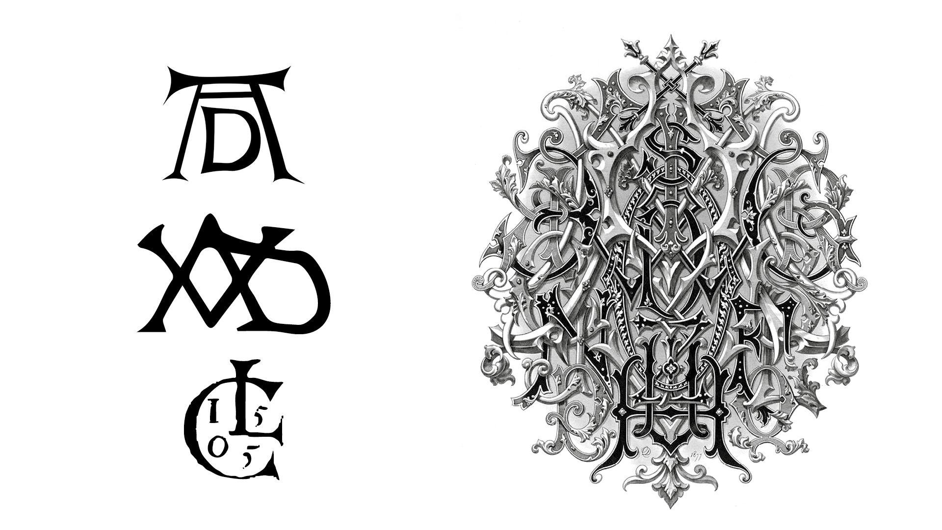
⛓️ History of ligatures, part 1/2
by @BlazeFoundry
#typography #Ligatures
Client Info
Server: https://mastodon.social
Version: 2025.07
Repository: https://github.com/cyevgeniy/lmst