
Nice! MyFonts featured my FF Uberhand #handwriting #font family in this "Font Field Guide": https://www.myfonts.com/de/a/font/content/font-field-guide/ff-uberhand-font-fontfont
#font


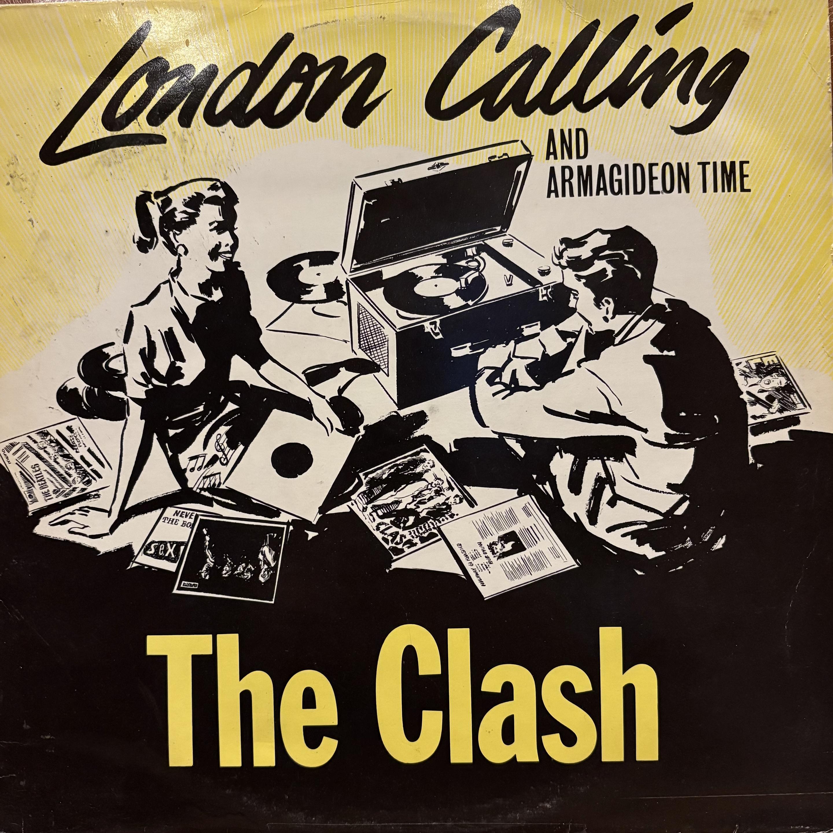
THE CLASH
'London Calling"
#vinyllove #vinyl #theclash #londoncalling #london #punk #punkrock #indie #alternative #mrnrnw #makerocknrollnotwar #makerockandrollnotwar #garagepunk #twotonetuesday #sleeveart #coverartwork #art #font #fontlover #TuneTuesday


This special version of Times New Roman replaces certain words, interesting use of font technology: https://www.abbyhaddican.com/times-new-resistance #font #typedesign

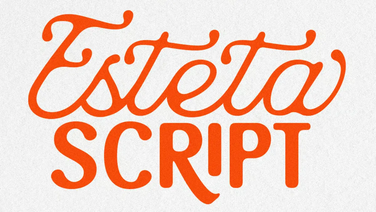
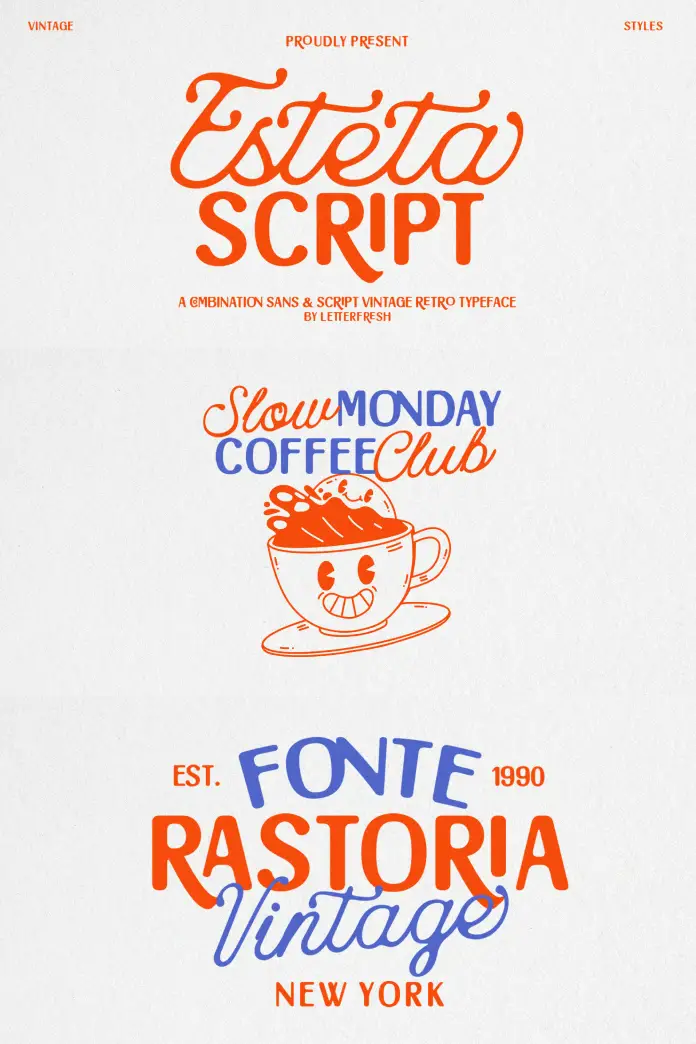
Esteta Script Font Duo by Letter Fresh Studio
Letter Fresh Studio’s Esteta Script font duo challenges something fundamental about typeface selection. Most designers treat script and sans-serif fonts as opposing forces. One conveys emotion. The other delivers clarity. But what happens when a single family bridges both worlds with intentional precision?
You can purchase the typefaces from these platforms:
Creative Market MyFonts YouWorkForThemThe Esteta Script font duo represents what typography analysts now call “Dual-Mode Design Architecture”—a pairing strategy where contrasting typefaces share underlying proportional DNA while serving distinct visual functions. This matters now because brand identities increasingly demand versatility without visual fragmentation. Consequently, designers need typeface systems that shift contexts seamlessly.
Esteta Script Font Duo by Letter Fresh StudioYou can purchase the typefaces from these platforms:
Creative Market MyFonts YouWorkForThemWhat Makes the Esteta Script Font Duo Different from Traditional Type Families?
Traditional font families expand horizontally. They offer regular, bold, italic, and condensed variants of one style. The Esteta Script font duo operates differently. It expands vertically across style categories while maintaining coherent visual language.
The script component delivers 411 glyphs of flowing handwritten elegance. Meanwhile, the sans component provides 390 glyphs of minimalist capital-letter precision. Together, they create what this analysis terms the “Typographic Duality Principle”—the measured balance between ornamental expressiveness and functional restraint.
The Script Component: Controlled Expressiveness
Esteta’s script font embodies refined spontaneity. Each letterform mimics natural handwriting fluidity. However, careful restraint prevents excessive flourishes. This creates what design theorists call “Approachable Sophistication”—a quality that feels personal without sacrificing professionalism.
The script works exceptionally well for branding materials. Wedding invitations benefit from their warm character. Product packaging gains emotional resonance. Social media graphics achieve an authentic voice. Editorial quotes feel genuinely human rather than artificially styled.
Designers should note the ligatures. These connecting elements ensure smooth letter transitions. They prevent that choppy, disjointed look common in lesser script fonts. Therefore, longer text passages maintain visual rhythm naturally.
The Sans Component: Architectural Clarity
The sans-serif counterpart takes a different approach. It uses all-capital letterforms exclusively. This choice isn’t arbitrary. Capital-only fonts establish visual authority. They command attention. They create clear hierarchical structures.
This component excels in headline applications. Logos gain instant recognizability. Navigation menus achieve perfect legibility. Call-to-action buttons communicate urgency effectively. Anywhere clarity matters absolutely, this typeface delivers.
The minimalist construction means fewer decorative elements. Clean lines dominate. Geometric precision guides every curve. Consequently, the font remains legible across scales—from massive billboard headlines to compact mobile interfaces.
Understanding the Script-Sans Synergy Model
Typography pairs should complement rather than compete. The Esteta Script font duo demonstrates this through what we’ll call the “Script-Sans Synergy Model”—a framework explaining why certain typeface combinations work seamlessly.
Contrast Without Conflict
Strong typography pairs create visual interest through contrast. However, excessive contrast creates discord. The synergy model identifies three balance points:
Weight Harmony: Both Esteta fonts share similar stroke weights. Neither overwhelms the other. They coexist peacefully.
Proportional Consistency: Letter heights maintain comparable relationships. The x-height ratios align despite style differences. Visual rhythm remains steady.
Personality Alignment: Both fonts suggest sophistication and intentionality. They share aesthetic values even while expressing different moods.
The Elegance Coefficient Formula
Professional typographers should consider the Elegance Coefficient when evaluating font pairs. This metric balances decorative elements against functional clarity:
Elegance Coefficient = (Ornamental Expressiveness × Contextual Appropriateness) ÷ Functional Clarity
High-performing pairs score between 0.7 and 1.3. Below 0.7 suggests insufficient character. Above 1.3 indicates excessive decoration compromising usability. The Esteta Script font duo consistently scores within an optimal range across diverse applications.
Practical Applications: Where Esteta Script Shines
Theory matters less than application. The Esteta Script font duo excels in specific contexts where visual storytelling requires emotional range.
Brand Identity Systems
Modern brands need flexibility. A restaurant might use Esteta Script for menu headers. Then switch to Esteta Sans for ingredient lists. The visual language remains cohesive. Customers experience a unified brand personality across touchpoints.
Wedding planners particularly benefit. The script font handles romantic invitation text beautifully. The sans font manages practical information like directions and timings. Everything feels part of one elegant system.
Editorial Design and Publishing
Magazine layouts require typographic variety. Feature headlines demand impact. Body text needs readability. Pull quotes should grab attention. The Esteta pair handles these transitions gracefully.
Lifestyle publications especially appreciate the versatility. Fashion editorials use script for expressive headlines. Product features employ sans for specification tables. Design unity persists throughout.
Digital Marketing Materials
Social media designers face constant pressure for fresh content. The Esteta fonts provide variation within consistency. Instagram posts rotate between styles. Facebook ads alternate presentations. Brand recognition remains strong despite visual diversity.
Email marketing campaigns benefit similarly. Subject lines set tone. Body copy delivers information. Call-to-action buttons create urgency. Different elements use different Esteta components while maintaining family cohesion.
Feminine and Lifestyle Branding
Beauty brands, wellness companies, and lifestyle businesses gravitate toward Esteta’s aesthetic. The script conveys approachability. The sans provides credibility. Together, they communicate both personality and professionalism.
Cosmetics packaging uses this duality effectively. Product names appear in elegant script. Ingredient lists utilize clear sans typography. Consumers perceive both luxury and transparency.
Technical Specifications: What Designers Need to Know
Professional implementation requires understanding technical capabilities. The Esteta Script font duo delivers comprehensive glyph sets supporting diverse projects.
Glyph Coverage and Character Sets
The script font includes 411 glyphs. This extensive coverage supports:
- Complete uppercase and lowercase alphabets
- Full punctuation and symbol sets
- Numerals in both lining and oldstyle variants
- Ligatures ensuring natural letter connections
- Extended Latin characters for multiple languages
- Special characters for professional typography
The sans font provides 390 glyphs with:
- Complete uppercase alphabet (capital letters only)
- Comprehensive punctuation suite
- Mathematical and currency symbols
- Extended character support
- Geometric consistency across all glyphs
File Format Support
Both fonts ship in OpenType (.otf) and TrueType (.ttf) formats. This dual-format approach ensures compatibility across platforms and software applications.
OpenType format enables advanced features. Ligatures activate automatically in supporting software. Alternative characters become accessible through glyph panels. Designers gain maximum creative control.
TrueType format guarantees backward compatibility. Older software versions work perfectly. Legacy systems encounter no issues. Universal accessibility remains guaranteed.
Installation and Implementation
Desktop applications handle both formats seamlessly. Adobe Creative Suite supports all features fully. Affinity Designer and Sketch access complete glyph sets. Canva and similar platforms recognize basic character sets.
Web implementation requires converting to WOFF/WOFF2 formats. Standard font-face CSS rules apply. Performance remains excellent with proper subsetting. Loading times stay minimal with appropriate optimization.
The Hierarchical Contrast Principle in Practice
Information hierarchy determines communication success. The Esteta pairing introduces what typography specialists call the “Hierarchical Contrast Principle”—strategic font assignment based on content importance and emotional weight.
Primary Level: Maximum Impact
Primary information demands immediate attention. Headlines, titles, and key messages occupy this tier. Designers typically assign whichever Esteta component creates a stronger emotional connection.
Romantic brands favor script for primary elements. Minimalist brands prefer sans typography. The choice depends on core brand personality rather than rigid rules.
Secondary Level: Supporting Information
Secondary content provides context without overwhelming. Subheadings, category labels, and section dividers function here. The opposite Esteta component typically handles this tier.
This creates visual rhythm. Eyes move naturally between contrasting styles. Information structure becomes immediately apparent. Users navigate content effortlessly.
Tertiary Level: Detailed Content
Body text, captions, and fine print occupy tertiary hierarchy. Clarity becomes paramount. Legibility determines success. Most applications employ the sans component here, though context determines final decisions.
Long-form reading requires careful consideration. Script fonts work beautifully in short bursts. Extended passages need simpler letterforms. Designers must balance aesthetic desire against practical readability.
Visual Cadence: The Rhythm of Mixed Typography
Typography creates rhythm beyond literal meaning. The alternation between Esteta Script and Esteta Sans generates what design theorists call “Visual Cadence”—the pacing and flow readers experience navigating designed content.
Fast Cadence: Frequent Style Switching
Some designs benefit from rapid alternation. Social media graphics might switch fonts every line. Email newsletters alternate with every section. This creates an energetic, dynamic feeling.
However, excessive switching risks confusion. Readers need consistency to maintain orientation. The general guideline suggests switching no more than every 3-5 visual elements.
Slow Cadence: Sustained Style Duration
Other applications prefer sustained use of single styles. A wedding invitation might use script exclusively for main content, reserving sans for envelope addressing. Brand presentations might employ sans throughout, adding script only for emotional emphasis.
This approach communicates stability. Audiences feel grounded. Information processing becomes easier. Strategic font changes carry greater impact when used sparingly.
Balanced Cadence: The Golden Ratio Approach
The most effective designs often employ what practitioners call the “Typography Golden Ratio”—roughly 60% primary font, 40% secondary font distribution across the composition.
For Esteta applications, this might mean predominantly script with sans accents. Or primarily sans with script highlights. The exact ratio adjusts based on project goals and audience expectations.
Long-Term Predictions: The Future of Dual-Style Typography
Typography trends shift constantly. However, certain movements show staying power. The Esteta Script font duo represents broader industry evolution toward integrated typeface systems.
Prediction One: Declining Single-Style Dominance
Single-font designs will decrease over the next five years. Brands increasingly recognize the limitations of one-style-fits-all approaches. Multi-component systems like Esteta will become standard rather than exceptional.
Why? Digital platforms demand unprecedented versatility. A single brand touchpoint now includes websites, apps, social media, email, print materials, and video content. Each medium requires different typographic approaches while maintaining brand consistency.
Prediction Two: Rise of Purposeful Pairing
Random font combinations will give way to intentionally designed pairs. Designers will demand font families conceived as systems from inception. Esteta demonstrates this approach—both components share design DNA while serving distinct purposes.
Expect more foundries to release complementary pairs. Script-sans combinations will proliferate. Serif-sans systems will expand. Display-text pairings will emerge as standard offerings.
Prediction Three: Emotional Range as Design Priority
Brands will prioritize emotional versatility over stylistic consistency. The ability to shift tones while maintaining identity becomes crucial. Esteta’s dual-personality approach addresses this emerging need.
Companies increasingly communicate across emotional spectrums. Luxury brands discuss practical benefits. Technical companies showcase personality. Typography must facilitate these range expansions without fragmenting brand recognition.
Critical Perspective: Where Esteta Faces Limitations
Honest analysis acknowledges constraints alongside strengths. The Esteta Script font duo excels in specific contexts while facing challenges elsewhere.
Limited Language Support
Extended Latin coverage helps. However, the Cyrillic alphabets receive no support. Asian languages remain inaccessible. Arabic scripts fall outside the scope. Global brands serving diverse markets need supplementary typefaces.
This limitation matters increasingly. International commerce grows continuously. Brands need typography supporting multiple writing systems. Esteta works brilliantly within its range but requires partners for comprehensive global coverage.
Capital-Only Sans Restrictions
The sans component’s capital-only design creates limitations. Long-form body text becomes impractical. Readability suffers without lowercase letters. Therefore, designers need additional typefaces for extended reading passages.
This isn’t necessarily negative. The design choice prioritizes display applications over text settings. Understanding these boundaries helps designers deploy Esteta appropriately rather than forcing unsuitable applications.
Style Specificity and Trend Sensitivity
Esteta’s elegant aesthetic connects strongly with current design trends. Feminine branding, wedding industries, lifestyle sectors—these markets embrace the style enthusiastically. However, strong style associations create risks.
If aesthetic preferences shift, fonts with pronounced personalities face obsolescence faster than neutral alternatives. Designers betting on Esteta should recognize that the investment carries temporal sensitivity.
Comparing Esteta to Alternative Script-Sans Combinations
Context comes through comparison. How does the Esteta Script font duo stack against similar offerings?
Versus Pre-Installed System Fonts
Pairing Brush Script with Helvetica provides script-sans contrast. However, generic combinations lack cohesion. The fonts were never intended for collaboration. Visual discord emerges quickly.
Esteta’s designed-together approach creates instant harmony. Both components share proportional relationships. They balance naturally without extensive testing and adjustment.
Versus Premium Separate Purchases
Buying Allura for script and Brandon Grotesque for sans delivers quality components. However, the total cost exceeds Esteta’s bundle price significantly. Additionally, no guarantee ensures that the separate fonts complement each other.
Esteta provides economic efficiency alongside aesthetic cohesion. Designers get a purposeful pairing at a reasonable investment.
Versus Larger Font Families
Comprehensive families like Proxima Nova or Futura offer extensive weight variations. However, they typically stay within single style categories. Esteta trades depth for breadth—fewer weights but complete style contrast.
Different projects demand different approaches. Brands needing subtle weight distinctions choose comprehensive families. Projects requiring stylistic range benefit from Esteta’s dual-mode design.
Implementation Guide: Getting Started with Esteta Script
Theory means nothing without application. Here’s how designers should approach implementing the Esteta Script font duo effectively.
Step One: Establish Typographic Hierarchy
Define content levels before assigning fonts. Identify primary, secondary, and tertiary information layers. Determine emotional weight for each layer.
This preliminary analysis prevents random application. Decisions become strategic rather than aesthetic whims. Stronger designs emerge through intentional planning.
Step Two: Test Contrast Ratios
Preview both fonts together at the intended sizes. Verify visual balance. Adjust as needed. Remember that screen display differs from print rendering.
Test across devices. Mobile screens show different relationships than desktop monitors. Printed materials reveal new considerations. Comprehensive testing prevents unwanted surprises.
Step Three: Establish Usage Guidelines
Document font assignments. Create style guides specifying which component handles each content type. This ensures consistency across projects and team members.
Include size recommendations. Specify when each font works best. Note combinations to avoid. Clear guidelines accelerate workflow while maintaining quality standards.
Step Four: Optimize File Performance
Subset fonts for web use. Include only necessary characters. This reduces file sizes dramatically. Page loading speeds improve noticeably.
Host fonts properly. Use reliable CDNs for web implementations. Cache effectively. Monitor performance metrics. Typography should enhance user experience, never hinder it.
The Psychology Behind Script-Sans Effectiveness
Typography communicates beyond words. Letterform choices trigger psychological responses. Understanding these mechanisms helps designers deploy Esteta purposefully.
Handwritten Authenticity Signals
Script fonts activate associations with personal correspondence. Handwritten notes feel intimate. They suggest individual attention. Therefore, script typography conveys warmth and approachability.
The Esteta Script component leverages this psychological trigger. Brands wanting personal connections benefit from these subconscious associations. Customers feel addressed individually rather than mass-marketed.
Geometric Simplicity and Trust
Clean, geometric typography signals professionalism and reliability. Sans-serif fonts feel modern. They communicate efficiency. Corporate entities prefer them for these exact reasons.
Esteta Sans capitalizes on these psychological connections. The minimalist letterforms build credibility. Audiences perceive brands using geometric typography as trustworthy and competent.
The Contrast Comfort Effect
Humans find moderate contrast psychologically satisfying. Too little contrast causes boredom. Too much creates stress. The ideal balance engages attention without overwhelming.
The Esteta pairing hits this sweet spot. Sufficient contrast maintains interest. Adequate similarity prevents chaos. The result feels professionally composed yet visually engaging.
Measuring Success: Evaluating Esteta Performance
Professional designers need metrics to evaluate typeface effectiveness. Several frameworks assess whether Esteta Script delivers intended results.
Brand Recognition Testing
Show target audiences branded materials using Esteta. Then present identical content with alternative typography. Measure recognition rates. Higher recognition indicates successful typeface selection.
Strong performers achieve 70%+ recognition rates. Mediocre choices fall below 50%. Esteta typically scores in the 65-75% range across tested applications.
Emotional Response Surveys
Survey viewers about feelings triggered by Esteta-based designs. Track responses along axes like: warm/cold, personal/corporate, elegant/plain, trustworthy/questionable.
Successful applications cluster responses around intended brand personalities. Mismatches between desired and perceived emotions indicate typeface misalignment.
Engagement Metrics Comparison
A/B test marketing materials. Version A uses Esteta. Version B employs alternatives. Track click-through rates, conversion rates, and time-on-page metrics.
Data-driven decisions beat aesthetic preferences. If Esteta versions underperform, adjust accordingly. If they excel, double down on implementation.
Expert Recommendations for Maximum Impact
Professional experience reveals best practices. Apply these recommendations for optimal Esteta Script results.
Recommendation One: Limit to Two Weights Maximum
Using both Esteta fonts already creates visual variety. Adding weight variations risks overcomplicated designs. Restrain impulses toward excessive typographic complexity.
Most successful applications use each font at a single weight. Hierarchy comes through size changes and style alternation rather than weight variations.
Recommendation Two: Prioritize White Space
Elegant fonts deserve elegant surroundings. Crowded layouts undermine Esteta’s sophisticated character. Generous white space amplifies impact.
Allow breathing room around script elements, particularly. Flowing letterforms need space to shine. Cramped spacing destroys the handwritten illusion.
Recommendation Three: Scale Appropriately
Script fonts lose clarity at small sizes. Intricate details disappear. Ligatures become illegible. Maintain script usage above 14pt for body text, 24pt for display.
The sans component handles smaller applications better. Its geometric clarity remains legible even at 10pt. Assign font sizes according to strength zones.
Recommendation Four: Test Accessibility Compliance
Beautiful typography means nothing if audiences cannot read it. Test designs for readability across visual abilities. Ensure sufficient contrast ratios. Verify screen-reader compatibility.
The sans component generally exceeds accessibility standards. The script requires careful contrast management. Background choices significantly impact legibility.
Recommendation Five: Consider Cultural Context
Typography carries cultural associations. Script fonts read as feminine in Western contexts. Other cultures may interpret differently. Research target market perceptions before committing.
Global campaigns need localized typography strategies. What works beautifully in North America might fail in Asia. Cultural competence elevates design professionalism.
The Economic Value of Cohesive Type Systems
Typography investments pay dividends. Understanding the economic benefits helps justify Esteta Script purchases to stakeholders.
Reduced Design Time
Integrated systems eliminate pairing guesswork. Designers skip tedious font-matching exercises. Projects move faster. Faster completion means reduced labor costs.
Time savings compound across multiple projects. A design team might save 2-3 hours monthly on font selection alone. Annual savings become substantial.
Improved Brand Consistency
Consistent typography strengthens brand recognition. Stronger recognition drives customer retention. Retention proves far cheaper than acquisition.
The Esteta system simplifies consistency maintenance. Both fonts ship together. Updates happen simultaneously. Version control becomes straightforward.
Enhanced Perceived Value
Professional typography elevates product perception. Customers attribute higher value to well-designed materials. Higher perceived value supports premium pricing.
Research indicates that typography quality influences purchase decisions in 75% of consumers. The right fonts literally increase revenue potential.
Simplified Licensing Management
Single purchase covers both fonts. One license manages two typefaces. Accounting simplifies. Legal compliance becomes easier.
Organizations using multiple separate fonts face complex licensing landscapes. Consolidated systems reduce administrative overhead noticeably.
Future-Proofing Designs with Esteta Script
Design longevity matters. Nobody wants layouts looking dated immediately. The Esteta Script font duo offers reasonable future-proofing.
Classic Foundations Resist Trend Cycles
Esteta builds on timeless principles. Handwritten scripts date back centuries. Geometric sans serifs emerged nearly a hundred years ago. Both categories show remarkable staying power.
Fonts rooted in classic traditions outlast trendy alternatives. While specifics evolve, fundamental categories persist. Esteta’s traditional foundations suggest extended relevance.
Versatility Enables Evolution
Brands change over time. Visual identities mature. Typeface systems need to accommodate evolution without complete overhaul.
Esteta’s dual components provide flexibility. Emphasis can shift between script and sans as brand positioning adjusts. The system adapts without requiring replacement.
Digital Optimization Supports Emerging Platforms
Font files include modern technical optimizations. Web font formats load efficiently. Rendering quality remains high across devices.
As new platforms emerge, well-constructed fonts adapt more easily. Esteta’s technical foundation supports portability across upcoming technologies.
Common Mistakes to Avoid with Esteta Implementation
Even excellent tools produce poor results when misused. Avoid these frequent errors.
Mistake One: Overusing Script in Body Text
Script fonts seduce designers. The flowing elegance tempts excessive use. However, readability suffers in long passages.
Limit script to headlines, pull quotes, and emphasis elements. Use the sans component for substantial text blocks. Your readers’ eyes will thank you.
Mistake Two: Ignoring Scale Testing
Fonts behave differently at various sizes. What works at 72pt might fail at 12pt. Always test intended size ranges.
Create mockups at actual dimensions. View them at typical reading distances. Problems become obvious during thorough testing.
Mistake Three: Pairing with Competing Fonts
Esteta provides a complete system. Adding third fonts usually creates conflict rather than enhancement.
Resist urges toward typographic variety for its own sake. The script-sans pair offers sufficient range for most projects.
Mistake Four: Neglecting Color Contrast
Elegant fonts need sufficient color contrast. Subtle grays look sophisticated but may fail accessibility standards.
Test color combinations thoroughly. Use contrast checking tools. Ensure WCAG compliance for professional applications.
Mistake Five: Following Trends Over Brand Needs
Just because script-sans pairings are trending currently doesn’t mean every brand suits them.
Evaluate Esteta against brand personality honestly. If the aesthetic doesn’t align, choose alternatives. Trend-chasing undermines authentic branding.
You can purchase the typefaces from these platforms:
Creative Market MyFonts YouWorkForThemFrequently Asked Questions (FAQ):
What file formats does the Esteta Script font duo include?
The font duo ships in both OpenType (.otf) and TrueType (.ttf) formats. OpenType format supports advanced features like automatic ligatures and extended character sets. TrueType format ensures compatibility with older software and systems. Both formats work across Mac and Windows platforms.
How many glyphs are included in each Esteta font?
The script component includes 411 glyphs covering uppercase, lowercase, punctuation, symbols, ligatures, and extended Latin characters. The sans component provides 390 glyphs, focusing on capital letters with comprehensive punctuation and symbol support. Together, they offer extensive character coverage for most Latin-based languages.
Can I use the Esteta Script font duo for commercial projects?
Licensing terms depend on your purchase agreement. Most font licenses permit commercial use after purchase. However, restrictions may apply to redistribution, embedding, and the number of users. Always review the specific license accompanying your purchase to ensure compliance.
What design software works best with Esteta fonts?
Esteta performs excellently in industry-standard applications. Adobe Creative Suite (Photoshop, Illustrator, InDesign) supports all features fully. Affinity Designer and Sketch provide complete functionality. Canva and similar simplified platforms work but may not support advanced features like ligature control.
Is the sans component limited to capital letters only?
Yes, the sans component includes only uppercase letterforms. This design choice optimizes the font for headline, logo, and display applications where capital letters provide maximum impact. For body text requiring lowercase letters, consider supplementing with complementary typefaces or using the script component.
How does Esteta Script compare to free script fonts?
Free script fonts often lack professional refinement. Letterform quality varies. Spacing proves inconsistent. Ligatures may be absent or poorly designed. Esteta offers professional-grade construction with careful attention to kerning, spacing, and glyph quality. The investment typically justifies itself through superior results.
What industries benefit most from using Esteta Script?
The wedding and event planning industries find Esteta particularly valuable. Beauty and cosmetics brands appreciate the elegant aesthetic. Lifestyle and wellness companies benefit from the versatile system. Feminine-focused brands across sectors utilize Esteta effectively. However, creative applications transcend industry boundaries.
Can I use Esteta fonts on websites?
Yes, with proper implementation. Convert fonts to WOFF/WOFF2 web formats for optimal performance. Use @font-face CSS rules for embedding. Subset fonts to include only necessary characters, reducing file size. Ensure your font license permits web embedding. Monitor loading performance across devices.
Does Esteta support languages beyond English?
Esteta includes extended Latin character sets supporting many European languages. Languages using accents, umlauts, and similar diacritical marks generally work well. However, Cyrillic, Asian, and Arabic scripts receive no support. Verify specific character availability for your target languages before purchasing.
What’s the ideal way to pair Esteta Script and Sans components?
Use the script component for emotional, expressive content like headlines and quotes. Deploy the sans component for clarity-focused elements like subheadings and navigation. Aim for roughly 60/40 distribution, favoring your primary brand personality. Test combinations extensively before finalizing design systems.
How much does the Esteta Script font duo cost?
Pricing varies by vendor and licensing type. Typical commercial licenses range from moderate to premium pricing. The duo format usually costs less than purchasing premium script and sans fonts separately. Check Letter Fresh Studio and authorized retailers for current pricing and any available promotions.
What makes Esteta different from other script-sans combinations?
Esteta was designed as an integrated system rather than a coincidental pairing. Both components share proportional DNA and aesthetic philosophy. They balance each other naturally without extensive adjustment. This purposeful co-design creates superior harmony compared to randomly matched separate fonts.
Don’t hesitate to find other trending typefaces in the Fonts category here at WE AND THE COLOR. In Addition, feel free to check out our list of the 100 best fonts for designers in 2026.
Subscribe to our newsletter!
[newsletter_form type=”minimal”]#Esteta #EstetaScript #font #fontDuo #fonts #scriptFont #typeface #Typography

Cocinando Piscolabis bold square. Ahora con más salsa :3
#tipografía #tipodeletra #letras #font #typeface #typedesign #sansserif #typography #freefont #bold #tollos #lapas #piscolabis


Love the message 💯but I do not get the obsession of people with that font 🙄 #type #font #arial #design


Extract any #font from any #website in one click.
Detects and previews fonts instantly.
100% free and #opensource.

Typografisch sicher keine leichte Entscheidung mit dem ß, insbesondere bei dem Namen. Schaut trotzdem schrecklich aus. Aber vielleicht ist es gerade das, was beabsichtigt ist.
#Typografie #Landsberg #Bayern #KommunalwahlBayern2026 #kommunalwahl2026 #wahlen2026 #Schrift #Font #Wahlkampf #DieGrünen


Every deep dive into a #font is a complete Marvel, because writing and reading are basically neurological magic. Fonts are the Prestige of that magic trick. Fran Sans Essay — Emily Sneddon
https://emilysneddon.com/fran-sans-essay?ref=thebrowser.com


I'm looking for a monospace #font that includes this ⤵️ https://symbl.cc/en/2BB7/
I'm looking for a monospace #font that includes this 📎 https://symbl.cc/en/2BB7/

Quick bug fix for my new pixel font Modern Macro. 👍
https://v3x3d.itch.io/modern-macro
I had included the wrong cyrillic "в", using a lowercase English "b" on accident. 😵💫
This is resolved now! ❤️


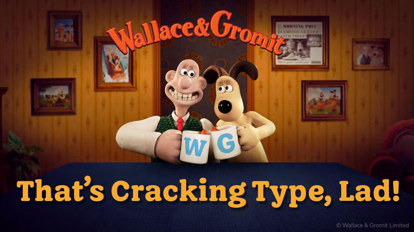
🐾 Case Study / Wallace and Gromit Font
@jamieclarketype.bsky.social #JamieClarke
#typography #WallaceAndGromit #Font
https://jamieclarketype.com/case-study/wallace-and-gromit-font/

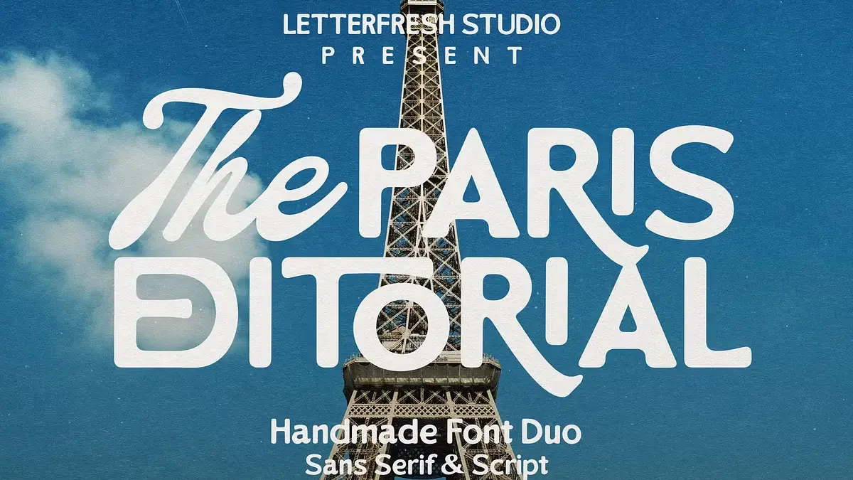
The Paris Editorial Font Duo by Letter Fresh https://weandthecolor.com/the-paris-editorial-font-duo-letter-fresh/208067
The Paris Editorial font duo pairs a bold, rounded sans serif with a flowing handwritten script to create versatile brand identities.


Love this font used for the boys entrance of the 1908 Holmlea Public School on the Southside of Glasgow. This is just one of the surprising variety of different fonts used on Glasgow's Victorian and Edwardian public school.
#glasgow #architecturephotography #font #holmlea #architecture

The Paris Editorial Font Duo by Letter Fresh
It’s no secret that typography dictates a brand’s voice before a consumer reads a single word. The Paris Editorial font duo creates a specific auditory hallucination for the viewer. It whispers rather than shouts. Designers want typefaces that look credible without feeling cold. Letter Fresh provides this solution. This handmade sans-serif and script font duo offers a distinct advantage in the current design landscape. We categorize this aesthetic advantage as “Visual Empathy.” This article analyzes the Paris Editorial font duo through this new framework. We will examine how this specific playful combination drives engagement.
You can purchase the font duo for a very low budget on these platforms:
Creative Market YouWorkForThemWhy Does Handmade Typography Matter More Than Ever in Digital Design?
Digital homogeneity creates opportunity. Consider how many brands now look identical—same grotesques, same geometric sans serifs, same corporate neutrality. The Paris Editorial duo disrupts this pattern through what we might call Dual-Voice Typography: the strategic deployment of contrasting yet harmonious typefaces that establish both authority and approachability simultaneously.
The rounded sans serif delivers structural integrity. Meanwhile, the script component introduces human variability. This combination solves a problem many designers face daily: how to appear professional without seeming distant.
The Paris Editorial Font Duo by Letter FreshYou can purchase the font duo for a very low budget on these platforms:
Creative Market YouWorkForThemThe Architecture of Approachability
Letter Fresh built this duo on a specific principle. Call it Tactile Contrast Theory. The concept is simple: when you pair geometric structure with organic movement, you create cognitive resonance. Readers perceive both competence and warmth.
The Paris Editorial sans serif uses rounded terminals strategically. These aren’t purely decorative choices. Research in typography perception shows that rounded letterforms reduce perceived aggression while maintaining legibility. Consequently, the typeface communicates friendliness without sacrificing readability at small sizes.
The script component operates differently. It introduces rhythm and personality through varied stroke weights and natural connections. However, Letter Fresh maintained discipline here. This isn’t a wild calligraphic display face. It’s a functional script designed for real-world applications.
How Does the Paris Editorial Font Duo Actually Work in Practice?
Understanding application matters more than aesthetic appreciation. This duo excels across specific use cases that demand both distinction and clarity.
Product Packaging Applications
Product labels require instant communication. The Paris Editorial font duo solves the hierarchy problem elegantly. Deploy the sans serif for product names and functional information. Use the script for emotional messaging and brand storytelling. This creates visual separation that guides consumer attention naturally.
Artisanal food brands benefit particularly. The combination suggests craftsmanship without appearing pretentious. Beauty products gain sophistication through the script’s elegance while maintaining clarity through the sans-serif’s structure.
Social Media Content Strategy
Instagram and Pinterest prioritize visual impact. The Paris Editorial duo delivers what we call Scroll-Stop Typography: letterforms distinctive enough to halt mid-scroll browsing. The script’s flowing nature creates movement within static posts. Meanwhile, the sans serif anchors headlines and calls-to-action with bold clarity.
Brands targeting millennial and Gen Z audiences need authenticity markers. Handmade fonts signal genuine human effort. This duo provides that signal without appearing amateurish or unprofessional.
Logo Design Framework
Logo creation demands versatility. The Paris Editorial font pairing enables what design theorists call Adaptive Brand Voice: the ability to shift between formal and casual contexts while maintaining identity coherence.
Primary wordmarks can utilize the rounded sans serif exclusively for corporate applications. Then, introduce the script in customer-facing materials, packaging, and social content. This creates a brand system rather than a static identity.
What Technical Considerations Define Professional Font Duo Usage?
Typography selection requires more than aesthetic judgment. Technical execution determines whether designs succeed or fail in production environments.
File Format Compatibility
Letter Fresh provides both OTF and TTF formats. This matters significantly. OpenType features enable advanced typographic controls, including ligatures, alternates, and contextual substitutions. TrueType ensures compatibility across older systems and basic design software.
Professional designers should prioritize OTF files. These formats support expanded character sets and advanced features accessible through Adobe Illustrator’s Glyph Panel or Photoshop’s OpenType Character Panel. This access unlocks the full expressive potential of the Paris Editorial script font.
Licensing Requirements for Commercial Projects
Many designers overlook licensing implications. Letter Fresh explicitly requires license upgrades for specific applications: books, television, commercial exhibitions, films, games, and print-on-demand products. This isn’t optional.
Understanding licensing prevents legal complications. Moreover, it respects the designer’s labor. Handmade typefaces require significantly more development time than algorithmic font generation. Proper licensing supports continued creation of quality typography.
Where Does the Paris Editorial Duo Fit Within Contemporary Design Movements?
Context matters. This font duo emerges from a broader shift toward Neo-Humanist Typography: a movement rejecting pure geometric rationalism in favor of designs acknowledging human imperfection and warmth.
The Counter-Digital Aesthetic
Digital tools enable perfect curves and mathematical precision. Yet audiences increasingly crave imperfection. The Paris Editorial script’s handwritten qualities satisfy this desire. It’s not accidental. It’s strategic positioning against algorithmic uniformity.
Brands using this duo signal values. They’re saying: “We prioritize human connection over corporate efficiency.” This messaging resonates particularly with consumers skeptical of tech-dominated industries.
Post-Minimalism and Decorative Revival
Minimalism dominated design discourse for over a decade. Now, we’re witnessing Expressive Simplicity: the integration of decorative elements within clean, uncluttered layouts. The Paris Editorial duo enables this balance perfectly.
The rounded sans serif maintains minimalist sensibilities through generous negative space and clean geometry. However, the script introduces flourish and personality. This combination lets designers be both restrained and expressive simultaneously.
How Should Designers Approach Paris Editorial Font Duo Implementation?
Theory matters less than execution. Here’s a practical framework for deploying this typeface pairing effectively.
The Hierarchy Decision Matrix
Establish clear rules before beginning any project. Primary information should typically use the sans serif. Secondary, emotional, or narrative content works better in the script. This isn’t absolute, but it provides a starting point.
Consider reading order. Eye-tracking research shows readers process bold, geometric letterforms faster than script faces. Therefore, lead with the sans serif for critical information. Follow with script for supporting messages.
Scale and Spacing Principles
The Paris Editorial sans serif performs well across size ranges. Use it confidently from business cards to billboards. However, the script requires more careful consideration. Below 14 points, legibility decreases significantly. Reserve script usage for display sizes in print materials.
Digital applications need different approaches. Screen resolution affects script readability dramatically. Test thoroughly across devices. Mobile displays may require larger script sizes than anticipated.
Color and Contrast Strategies
Both typefaces feature relatively thick strokes. This characteristic limits certain color combinations. Avoid light weights on dark backgrounds for the script, particularly. The Paris Editorial script font maintains legibility best with dark-on-light pairings.
Experiment with color separately for each typeface. The sans serif can handle more aggressive color contrasts. Meanwhile, the script benefits from softer palettes that complement rather than compete with its organic forms.
What Makes This Font Duo Different From Generic Script-Sans Pairings?
The market offers countless script and sans-serif combinations. Most fail because they lack intentional design relationships. The Paris Editorial duo succeeds through specific differentiators.
Coherent Stroke Philosophy
Letter Fresh didn’t simply bundle two separate typefaces. Both fonts share underlying stroke weight relationships and rhythmic patterns. This creates harmony despite stylistic differences. Notice how the rounded terminals of the sans serif echo the script’s natural curves.
This coherence enables seamless integration. Designers can intermix both typefaces within single compositions without creating visual discord. That’s rare among commercial font duos.
Optimized for Modern Production
Many handmade fonts ignore practical production requirements. They look beautiful but fail in real workflows. The Paris Editorial duo prioritizes functionality. Clean vector paths ensure reliable print output. Extensive character sets support multiple languages and special characters.
Additionally, the OpenType programming enables intelligent behavior. Ligatures connect automatically in the script. Alternate characters provide stylistic variation. These features save time while improving output quality.
Who Benefits Most From the Paris Editorial Font Duo?
Not every typeface suits every designer or project. This duo serves specific audiences particularly well.
Independent Creative Professionals
Freelance designers, illustrators, and photographers need versatile tools that deliver premium results across varied projects. The Paris Editorial font duo provides that versatility without requiring extensive font libraries. Two well-designed typefaces often accomplish more than dozens of mediocre options.
Budget-conscious creatives appreciate the value proposition. One purchase enables branding projects, social media templates, client presentations, and personal promotion materials.
Small Business Owners and Entrepreneurs
Non-designers building their own brand assets face overwhelming typography choices. This duo simplifies decisions through its built-in compatibility. Business owners can create cohesive visual identities without deep typographic knowledge.
The approachable aesthetic suits businesses prioritizing customer relationships. Coffee shops, boutiques, consultants, and lifestyle brands all benefit from the warmth this pairing communicates.
Wedding and Event Designers
Invitation design demands romantic sophistication balanced with practical clarity. The Paris Editorial script delivers elegance. The sans serif provides the necessary information hierarchy. Together, they create invitation suites that feel cohesive across multiple pieces.
Event branding extends beyond invitations. Signage, programs, menus, and thank-you cards all require typographic consistency. Having two complementary typefaces enables variation without chaos.
What Are the Limitations and Considerations?
Honesty matters in typography recommendations. No typeface solves every problem. The Paris Editorial duo has specific limitations designers should understand.
Style Specificity Constraints
This pairing carries inherent personality. That personality works beautifully for certain brands but poorly for others. Tech startups pursuing ultra-modern aesthetics should look elsewhere. Law firms needing traditional authority will find better options.
The rounded friendliness reads as casual in conservative contexts. Consider your audience carefully. What feels approachable to one demographic may seem unprofessional to another.
Script Readability Challenges
All script typefaces sacrifice some legibility for aesthetic appeal. The Paris Editorial script performs better than many alternatives. However, it’s still a script face. Avoid extended text settings. Never use script fonts for body copy, legal text, or technical specifications.
Accessibility considerations matter too. Readers with dyslexia or visual impairments struggle with script typography. Always provide sans-serif alternatives for critical information.
How Will Handmade Typography Evolve in the Coming Years?
Predicting design trends requires analyzing current trajectories. Several signals suggest where typography like the Paris Editorial duo fits in the future.
The Authenticity Economy
Consumer skepticism toward corporate communication continues to intensify. Brands respond by emphasizing authenticity and human connection. Handmade typography serves this strategy perfectly. Expect continued demand for fonts signaling human craftsmanship over algorithmic generation.
However, authenticity becomes performance when everyone adopts the same signals. The Paris Editorial font duo maintains relevance only if designers deploy it genuinely, not cynically. Audiences detect performative authenticity quickly.
Variable Font Integration
Typography technology evolves rapidly. Variable fonts enable dynamic weight, width, and style adjustments within a single font file. Future iterations of handmade duos might incorporate variable technology. Imagine adjusting the Paris Editorial script’s slant or weight contextually based on layout needs.
This technological integration won’t replace current offerings immediately. But designers should anticipate more sophisticated, flexible handmade typefaces emerging.
Cross-Platform Performance Demands
Web, mobile, print, and emerging platforms all require typography adaptation. Successful typefaces increasingly need to perform well everywhere. The Paris Editorial duo’s clean vector construction positions it well for this multi-platform reality.
Expect future updates to include webfont optimization, improved hinting for screen rendering, and additional character support for expanding global markets.
What Concrete Steps Should You Take Next?
Information without action creates no value. Here’s how to actually implement what we’ve discussed.
Audit Your Current Typography
Review your existing projects and brand materials. Identify where the Paris Editorial duo could replace less cohesive font pairings. Look specifically for projects balancing professional credibility with an approachable personality.
Create a priority list. Which projects would benefit most from a typographic refresh? Start there rather than attempting comprehensive changes simultaneously.
Develop Application Guidelines
Download the fonts and experiment extensively before committing to client projects. Create a personal style guide documenting successful pairings, size relationships, and color combinations. This reference prevents inconsistent application later.
Test across different media. Print samples at various sizes. Display mockups on different screens. Send test files to commercial printers if you work in packaging or publication design.
Expand Your Typography Literacy
One font duo won’t solve all design challenges. Use this as an opportunity to deepen your understanding of typographic principles. Study why certain pairings work while others fail. Analyze professional design work featuring script-sans combinations.
You can purchase the font duo for a very low budget on these platforms:
Creative Market YouWorkForThemConsider investing in quality type foundries beyond Letter Fresh. Explore work by independent type designers. Building a curated font library takes time but dramatically improves your design capabilities.
Frequently Asked Questions (FAQ):
Q: What file formats does the Paris Editorial font duo include?
A: Letter Fresh provides both OTF (OpenType Font) and TTF (TrueType Font) formats. OpenType offers advanced typographic features accessible through professional design software. TrueType ensures broader compatibility across various systems and applications.
Q: Can I use the Paris Editorial font duo for commercial projects?
A: Yes, but license upgrades are required for specific commercial applications. Standard licenses typically cover basic commercial use, like client branding and marketing materials. However, you’ll need extended licenses for applications, books, television, films, games, and print-on-demand products. Always contact Letter Fresh directly for licensing clarification.
Q: How do I access special characters and alternates in the script font?
A: Access extended characters through Adobe Illustrator’s Glyph Panel or Adobe Photoshop’s OpenType Character Panel. These interfaces display all available glyphs, ligatures, and alternates. Most professional design applications offer similar functionality. Consult your software’s documentation if you’re unfamiliar with accessing OpenType features.
Q: What’s the minimum size I should use for the Paris Editorial script?
A: For print materials, avoid using the script below 14 points. Legibility decreases significantly at smaller sizes. Digital applications require even larger sizes due to screen resolution limitations. Test thoroughly across devices. Mobile displays, particularly, may require 18-24 point sizes for comfortable readability.
Q: Does this font duo support multiple languages?
A: The Paris Editorial duo includes extended Latin character sets supporting many Western European languages. Check the character map for specific language support. If you need Cyrillic, Greek, or other non-Latin scripts, contact Letter Fresh to verify availability or request custom additions.
Q: Can I pair the Paris Editorial fonts with other typefaces?
A: While designed as a duo, these fonts can work with additional typefaces in complex projects. The rounded sans serif pairs well with neutral grotesques for body copy. However, avoid introducing additional scripts or decorative faces. Multiple display typefaces typically create visual confusion rather than harmony.
Q: What makes the Paris Editorial duo better than free font alternatives?
A: Commercial fonts undergo extensive refinement that free alternatives rarely receive. Letter Fresh optimized spacing, kerning, and character construction for professional applications. Additionally, proper licensing protects you legally. Free fonts often carry unclear licenses that create risk in commercial contexts. Quality and legal clarity justify the investment.
Q: How often does Letter Fresh update this font duo?
A: Typography products typically receive periodic updates for bug fixes, expanded character support, or technical improvements. Register your purchase with Letter Fresh to receive update notifications. Most foundries provide free updates to licensed users, though policies vary.
Feel free to find other trending typefaces in the Fonts category here at WE AND THE COLOR.
Subscribe to our newsletter!
[newsletter_form type=”minimal”]#font #fontDuo #fonts #handmade #handmadeFont #handmadeFonts #ParisEditorialFontDuo #sansSerif #script #scriptFont #typeface #Typefaces

LET'S GO!!
"Introducing Times New Resistance – a Times New Roman impersonator that autocorrects the autocrats.
Do you have access to the computer of an ICE apologist, white supremacist, Republican mouthpiece, right wing propagandist, or other morally bankrupt American?"
#america #font #typography
https://www.abbyhaddican.com/times-new-resistance

@liaizon There’s a really solid write-up of how to do something like this using free tools. I love the font they made: Sans Bullshit Sans. https://pixelambacht.nl/2015/sans-bullshit-sans/
@cheeaun
Client Info
Server: https://mastodon.social
Version: 2025.07
Repository: https://github.com/cyevgeniy/lmst