
Can't stop, won't stop. This photo of Liverpool Street Station is technically from after the Victorian era, 1905–1915.
#MyFonts

I could make these all day. Birmingham New Street Station in 1900, with a late 19th century inspired typeface.

Look at what I found, a 132-year-old late 19th century image to use a "late 19th century inspired" typeface over. This is Newcastle Central Station on June 18th 1894.


MyFonts is promoting a new typeface "Dickens" with an animated gif of AI-generated junk. This is so frustrating. The typeface is "late 19th century inspired," so use a late 19th century image! They are all over 100 years old and in the public domain.
https://link.myfonts.com/view/60abde9b0f84ff6b0e6d3cbbpxfbx.jk4/58397235

En ole nähtävästi ensimmäinen, joka on kironnut #MyFonts'in nykyistä tapaa myydä #webfont'it vain vuosittaisina lisensseinä: #Reddit'issä näkyy asiasta keskustellun jo pari vuotta sitten. Samaisesta lähteestä sain kuitenkin tiedon, että yhä on verkkokauppoja, jotka myyvät webfontteja kertamaksuperiaatteellakin, esim. #Fontspring. #fontit #kapitalismi
https://www.fontspring.com

#MyFonts’ new EULA for desktop fonts came into effect November 7. For an article published by @typographische ([DE], now in revision) @typolis quoted an info about it sent by Monotype to foundry partners: “The Desktop License will no longer permit font embedding (except in the case of non-editable, non-commercial PDFs)”
https://tgm-online.de/blog/lizenzwende-bei-myfonts

Selbst für Designprofis und Typoexperten ist der in juristischer Fachsprache verfasste Text der sogenannten Endbenutzer-Lizenzvereinbarung (EULA) nicht immer leicht zu verstehen. In einem kürzlich von der Typographischen Gesellschaft München veröffentlichten Beitrag werden die Lizenzbedingungen gleich mehrfach falsch interpretiert. In diesem Artikel bemühe ich mich um eine Klarstellung.
#PDF #Einbetten #Monotype #MyFonts #Typographie #Lizenzrecht


Der tgm-Newsletter #151 ist da – rund um Sprache, Design und Typografie.
→ https://153508.seu2.cleverreach.com/m/16600954/
– Vortrag mit Kathrin Kunkel-Razum (ehem. Duden-Chefredakteurin) über Sprachwandel & Wortpolitik – diesen Donnerstag
– tgm-Workshops zu Tiefdruck, KI × Recht, TikTok, Podcasts und barrierefreie PDFs
– aus der Community: Ausstellung bei Weissraum & Vortrag bei https://typo.social/@lttrspc, SFSCON, Münchner Bücherschau …
– außerdem: Blog zu #MyFonts und viele weitere Tipps und Events zum Herbst

Glyphic Sans Font Family by Font Catalogue: https://weandthecolor.com/glyphic-sans-font-family-font-catalogue/206464
#font #fonts #typeface #fontfamily #myfonts #typography #design #graphicdesign
Moriz Font Family by Tipo Pèpel https://weandthecolor.com/moriz-font-family-tipo-pepel/205648
#font #typeface #fonts #fontfamily #typography #newfonts #myfonts #bestfonts #design #graphicdesign


➸ Born as Colar a decade ago and now reborn as ATREON with a revitalized style.
More expressive than ever, its expanded character set brings your words to life across every platform and context with a unique tone of voice.
Ready to uplift your headlines and craft a brand that truly stands apart?
🔗 Give it a try!
https://www.myfonts.com/collections/atreon-font-jvb
#Atreon #NewRelease #FontRelease #MyFonts #Monotype #TypographyLove #DesignInspiration


my #typeface #mellsans is finally on #myfonts
https://www.myfonts.com/collections/mell-sans-font-abuse-of-notation


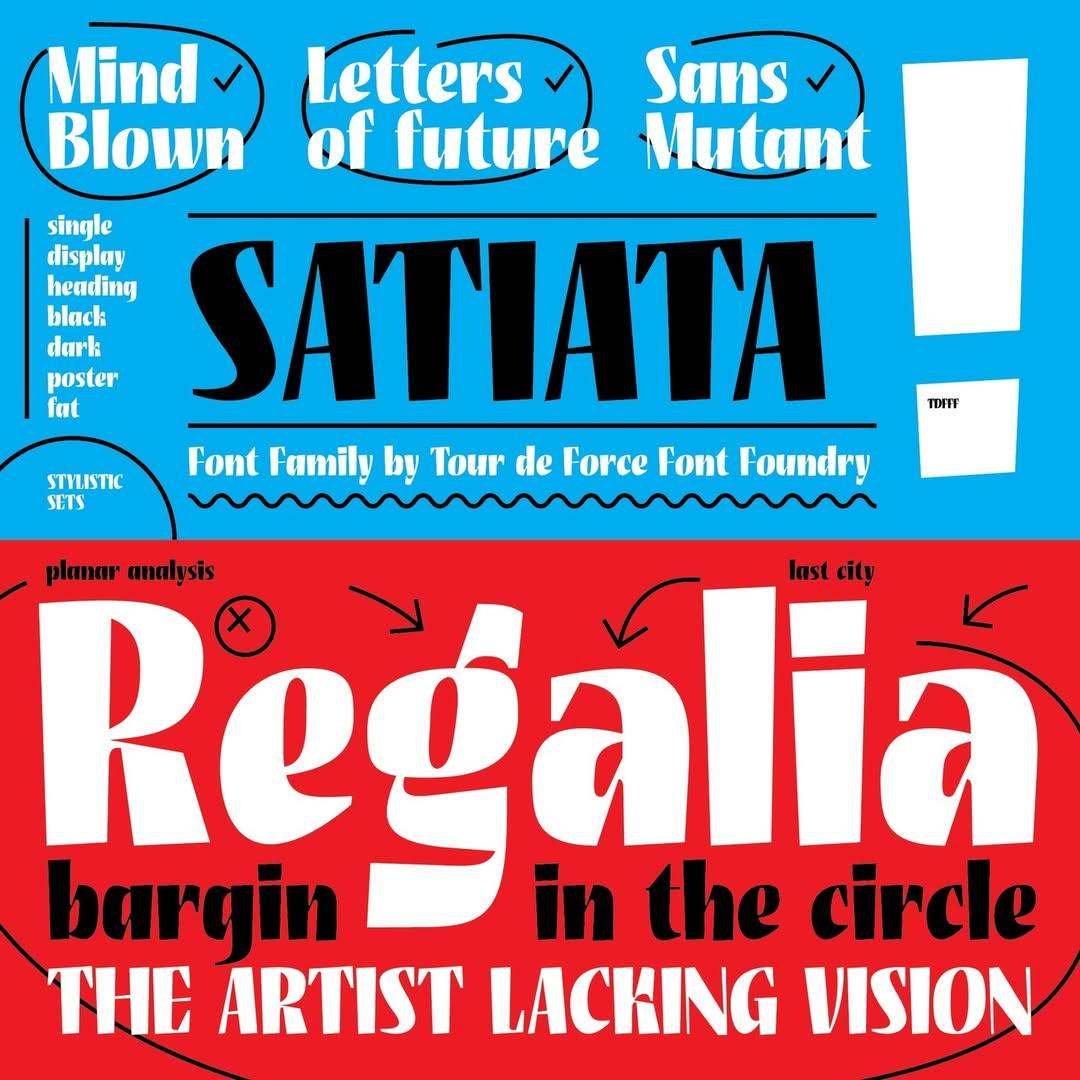
Satiata is a bold, single-weight display #font designed by Dušan Jelesijević and released by Tour de Force Font Foundry in 2022.
Its condensed proportions make it ideal for posters, titles, outdoor graphics, packaging, branding and websites. It includes an extended Latin character set, two stylistic sets and #ligatures.
Satiata is currently available for purchase through #Fontspring and #MyFonts

@iris
Hi Iris.
It is Recoleta, designed by Jorge Cisterna for Latinotype @Latinotype at MyFonts
@MyFonts
#MyFonts #Latinotype #Recoleta
https://www.myfonts.com/collections/recoleta-font-latinotype

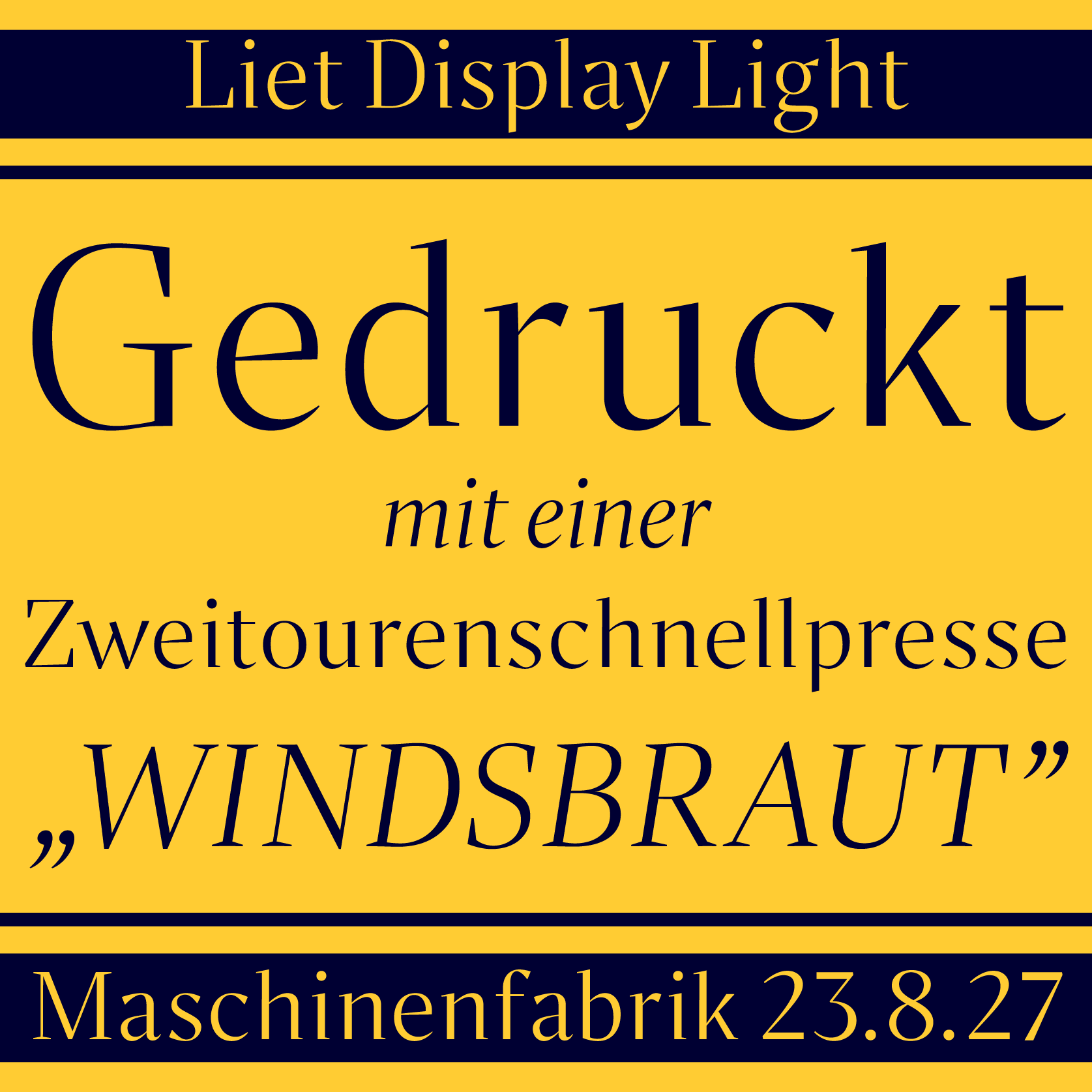
Liet Display Light available on Fontspring and Myfonts.
https://lnkd.in/e-SiAPQ7
https://lnkd.in/dUy-wXEW
#newfonts #typeface #branding #fontsinuse #liet #stanleyfonts #graphicdesign #myfonts #fontstand Liet #fontdesign #font #fontdesigner #typefacedesign #type #typedesign #typefaces #typematters #typography #graphicdesign #typefoundry #reels #advertising #marketingdigital #branding #brandidentity #brand #branddesign #logo


So apparently #Monotype will “discontinue” the FontShop website soon ...a good opportunity to take a last look at the interview @davidsudweeks did with me in 2015 about my FF Hertz type family, as I doubt it will be ported to the #MyFonts website:
https://www.fontshop.com/content/interview-with-ff-hertz-designer-jens-kutilek
Client Info
Server: https://mastodon.social
Version: 2025.07
Repository: https://github.com/cyevgeniy/lmst