Today we’re launching a sister #publication, #Iran #War Dispatches. For the foreseeable future, we’ll be launching daily reporting and updates on the war there.
Sign up — it’s free! https://www.iranwar.news
Today we’re launching a sister #publication, #Iran #War Dispatches. For the foreseeable future, we’ll be launching daily reporting and updates on the war there.
Sign up — it’s free! https://www.iranwar.news
https://www.theguardian.com/us-news/2026/feb/26/trump-epstein-files-fbi. I can't say that I'm in the least bit surprised - & there is probably much more such material that the #DOJ is withholding from #publication on spurious grounds in order to protect their Lord & Master, #Trump.
The cost of teaching
https://subspacewagon.systems/the-cost-of-teaching/
____
"And please share openly" etc.
https://www.tilley.blog/cross-post-from-tilley-solar-for-re-emphasis-open-access-open-culture-open-learning-anti-thought-leaders-new-hope-the-beginning-of-a-new-community/
A Return to Attraction to Light and the End of the Public Intellectual
https://www.scifi.global/a-return-to-attraction-to-light-and-the-end-of-the-public-intellectual/
____
#Poetry #PoemADay #PoetryCommunity #Poem #TodaysPoem #WritingCommunity #literature #art #humanities #amwriting #CreativeWriting #WritersOfMastodon #writing #indie #SmallWeb #careerism #Culture #OpenAccess #community #publication #thoughtLeader #UnitedStates #Utopia #Babylon5 #evolution #Kosh #Leadership #Minbari #Solarpunk #StarTrek #StarTrekTNG #Valen #Vorlons #PublicEducator
Our newest publication is out!
We showed that the yeast core factor (CF) binds and specifically recognizes promoter DNA in a two-step process, after which it will recruit RNA Polymerase I, inducing DNA bending and melting to start the transcription process.
https://academic.oup.com/nar/article/54/5/gkag153/8495788
#academicChatter #publication #science #nucleicAcidsResearch #nucleicAcids #yeast #dna #transcription
A quotation from Madeleine L'Engle
Many years ago, when A Wrinkle in Time was being rejected by publisher after publisher, I wrote in my journal, “I will rewrite for months or even years for an editor who sees what I am trying to do in this book and wants to make it better and stronger. But I will not, I cannot diminish and mutilate it for an editor who does not understand it and wants to weaken it.”
Now, the editors who did not understand the book and wanted the problem of evil soft peddled had every right to refuse to publish the book, as I had, sadly, the right and obligation to try to be true to it. If they refused it out of honest conviction, that was honorable. If they refused it for fear of trampling on someone else’s toes, that was, alas, the way of the world.
Madeleine L'Engle (1918-2007) American writer
Speech (1983-11-16), “Dare To Be Creative,” Lecture, Library of Congress, Washington, DC
More about this quote: wist.info/lengle-madeleine/822…
#quote #quotes #quotation #qotd #madeleinelengle #lengle #wrinkleintime #awrinkleintime #editing #editor #evil #principle #problemofevil #publication #rewriting #writing #rejection
Check the classifieds :thinkhappy:
PC Magazine, July 1995
Found this while digging for articles on windows 3d movie maker for a friends video.
https://the-avocado.org/2018/03/16/lets-read-pc-magazine-july-1995/
---
#lgbtq #gay #queer #lesbian #bi #trans #kink #computers #1990s #90s #1995 #lgbt #femboy #history #advertising #nonbinary #classifieds #archive #magazine #publication #print #PCmagazine #linux #bsd #foss #tech #technology #retroComputing #arch #debian #windows #programming #culture


Hey #AcademicFedi I need your opinion on something 🙏
I was recently asked to review on a platform I did not know: https://www.qeios.com
Anyone knows about it? It did not seem too fishy at a glance but their economic model and who is behind it is not entirely clear to me so I'm a bit wary of potential link with people with an agenda (almost got bitten before).
So I'm not sure I want to encourage people to use that can of platform instead of, say, @PeerCommunityIn until I know more about them and the guarantees that all the content will not be lost five years from now...
All opinions, feedbacks, or boosts are welcome 🙂
#academia #academicChatter #ESR #helpESR #askESR #review #journal #publication #scientificPublication #scientificPublishers
🆕 #Publication: In „Addiction and the Medicalisation of Conspicuous Behaviour” (Palgrave Macmillan) Bruce M. Z. Cohen, Martin Harbusch & Jo Reichertz (KWI) provide the first social constructionist volume on the medicalisation of addictions.

L' #algorithme de #X pourrait #orienter les #utilisateurs vers des positions plus conservatrices selon des #chercheurs , selon une #publication d’une #étude #scientifique dans #Nature
On s'en doutait déjà.
La #science l'a maintenant prouvé
www.frandroid.com/culture-tech...
Il vous manipule en 7 semaines...
L' #algorithme de #X pourrait #orienter les #utilisateurs vers des positions plus conservatrices selon des #chercheurs , selon une #publication d’une #étude #scientifique dans #Nature
On s'en doutait déjà.
La #science l'a maintenant prouvé
"Sollte es nicht Zeit sein, diese Bewertungskriterien allgemein zu hinterfragen und [ob] man den dahinterliegenden Wettbewerb überhaupt benötigt?"
New #publication: Collaborative article out with the Journal of Human Rights Practice: "Exiled Activists from #Myanmar: Predicaments and Possibilities of #HumanRights #Activism from Abroad". We made it #openaccess - please share widely! #WhatsHappeningInMyanmar 🙏 academic.oup.com/jhrp/article...
Hä? Magazine: The 1,000-Page Hardcover That Proves Health Publishing Was Never Supposed to Be This Boring
There’s a 1,000-page hardcover sitting somewhere that shouldn’t exist — not by the logic of modern media, at least. Hä? Magazine ran for 12 years. It covered earwax, genitals, blood, and bones. It was distributed through Swiss pharmacies. And somehow, it became one of the most awarded, most aesthetically radical health publications in recent memory.
That contradiction is exactly the point.
The complete collection of all 52 issues — now bound into a single art-directed hardcover book by studio marcus kraft — isn’t just a publishing milestone. It’s a design artifact that reframes what health communication can look like when the people making it refuse to dumb it down or dress it up in clinical beige.
Hä? Magazine was never trying to be safe. It was trying to be true.
Hä? Magazine, 1000+ pages hardcover book, art directed by studio marcus kraft.What Exactly Was Hä? Magazine — and Why Does It Matter Now?
Hä? Magazine launched in 2012. It was published and distributed exclusively through Rotpunkt Apotheken pharmacies in Switzerland. That distribution model alone is worth pausing on. This wasn’t a newsstand title competing for casual readers. It arrived in pharmacies — spaces typically associated with sterile design, cautious language, and a fundamental distrust of anything that looks like it belongs in an art gallery.
Yet that’s precisely where it landed.
The magazine targeted readers starting at age 16. Every single issue focused on one topic about the human body. Think: digestion, skin, the nervous system, reproduction, and pain. Subjects that are simultaneously universal and, somehow, persistently avoided in mainstream media. Hä? didn’t avoid them. It leaned all the way in.
The content was always thoroughly researched. The aesthetics were explicitly influenced by punk culture.
That combination — rigorous editorial standards and deliberately confrontational visual language — is what the industry would now call content disruption through form. But the Hä? team was doing it a decade before that phrase became a conference staple.
The Punk-Health Publishing Framework
There’s a specific design and editorial philosophy embedded in the Hä? project that deserves its own name. Call it Punk-Health Publishing: the practice of applying counterculture visual codes to medically accurate, ethically responsible health content aimed at young audiences.
Punk-Health Publishing operates on a specific set of assumptions. First, young readers are not fragile — they can handle direct, unfiltered information about their own bodies. Second, aesthetic discomfort is a legitimate editorial tool. An image that shocks you is an image that stays with you. Third, pharmacies and doctors’ offices are not neutral spaces — their visual vocabulary carries authority, and that authority can be redistributed through design.
Hä? Magazine built its entire identity on these three premises.
How Studio Marcus Kraft Shaped 12 Years of Visual Identity
Studio marcus kraft didn’t just design a magazine. The studio art directed and designed Hä? Magazine for an uninterrupted 12 years, in close collaboration with editor Rainer Brenner. That kind of sustained creative partnership is genuinely rare in independent publishing.
Think about what 12 years means in practice. It means developing a visual system flexible enough to accommodate 52 distinct topics — each one requiring its own visual logic — while maintaining enough consistency that the collection reads as a cohesive body of work. It means building relationships with photographers, illustrators, and artists over the long term, rather than recycling talent pools issue by issue.
The list of collaborators that passed through Hä? reads like a cross-section of contemporary European and international visual culture. Simon Trüb, Yves Suter, Randy Tischler, Peter Hauser, Anne Morgenstern, Eva Kurz, Fabian Unternährer, Heji Shin, Ornella Cacace, Ryan McGinley, Jamie Warren, Beni Bischof, Svenja Plaas, Marlon Ilg, Lina Müller, Richard Kern — among many others.
That roster is not accidental. It reflects a deliberate curatorial philosophy: bring in artists whose existing work carries energy, risk, and a specific point of view. Then direct that energy toward a health topic. The friction between an artist’s native aesthetic and the subject matter of a given issue is often where the most interesting visual solutions emerge.
The Art Direction Model That Made It Work
Studio marcus kraft’s approach to art direction on Hä? can be characterized as Subject-Led Visual Collision. Each issue started with a body topic. The art direction then asked: What visual language would be unexpected here? What aesthetic would force the reader to look at this subject differently?
This is distinct from conventional magazine design, which typically starts with brand consistency and asks how the content can be accommodated within that framework. Hä? reversed the hierarchy. The subject came first. The visual language was built around it, not imposed on top of it.
Over 12 years, that approach produced 52 different visual statements — each one coherent on its own terms, and collectively forming an archive that no single aesthetic framework could have produced.
The 1,000-Page Hardcover: What the Complete Collection Represents
The decision to compile all 52 issues into a single hardcover book is not merely archival. It’s a recontextualization.
As individual issues, each edition of Hä? Magazine existed in time — distributed at pharmacies, read in specific moments, then shelved or discarded. The physical book collapses that timeline. It places 12 years of work into a single object, which forces a different kind of reading.
Suddenly, you can trace the evolution of the design language across issues. You can see which visual strategies the studio returned to and which it abandoned. You can read the 52 body topics as a cumulative argument — an editorial statement about what young people deserve to know about their own bodies.
Over 1,000 pages is not a coffee table book. It’s a monograph. It’s closer in format and ambition to the kind of institution-cataloguing objects that museums produce for major retrospectives.
Why the Hardcover Format Is the Right Choice
A 1,000-page hardcover for a magazine archive might seem excessive. It isn’t. The format is load-bearing here.
Hä? Magazine spent 12 years existing in a context defined by disposability — pharmacies are not libraries, and free-distribution magazines are not collector’s items. The hardcover book reframes every page within it as something worth preserving. That reframing is itself an editorial act.
It also makes the collection citable. A researcher studying Swiss independent publishing, youth health communication, or design-led editorial work now has a single physical reference object. A design student can hold it. A curator can shelve it. An educator can assign it.
The format says: this work matters enough to last.
Why Hä? Magazine Is a Case Study in Long-Form Creative Partnership
Most publications run through creative directors on a faster cycle. The average tenure for a magazine art director is roughly two to four years — enough time to establish a visual identity and see it mature, but rarely enough to fully explore its possibilities.
Studio marcus kraft had 12 years.
That extended runway allowed for something unusual: a design practice that could actually learn from its own outputs, iterate in real time, and build institutional knowledge about what works for this specific audience, this specific subject matter, and this specific distribution context.
That’s a model worth studying. Not just for magazines, but for any long-form creative project where consistency and evolution need to coexist.
The Role of Editor Rainer Brenner
Any serious analysis of Hä? Magazine has to acknowledge Rainer Brenner, the editor who co-piloted the project for its entire run. The collaboration between Brenner and studio marcus kraft was foundational. Good editorial design doesn’t happen when designers and editors work in parallel — it happens when they build a shared language.
Brenner’s editorial philosophy — thorough research, no taboos, direct address to young readers — provided the structural logic that the visual design could then work within and against. That tension between editorial responsibility and visual provocation is what gave each issue its particular energy.
The Awards Record and What It Actually Signals
Hä? Magazine won a dozen awards over its run, including gold at the Art Directors Club of Switzerland. That’s a meaningful data point, but it requires some context.
Awards in design communicate peer recognition. They confirm that a piece of work has met or exceeded the standards that practitioners in the field have agreed to value. A gold at the ADC Switzerland, specifically, signals that the work was recognized as exceptional within a highly competitive Swiss design culture — a culture known for precision, formalism, and a certain resistance to visual excess.
For a punk-inflected health magazine to win gold in that context is genuinely significant. It suggests that the jury saw past the provocative surface and recognized the craft underneath. Good punk design is still design. It still requires technical rigor, compositional intelligence, and a clear understanding of what the work is trying to do.
Hä? had all of that. The awards confirmed it.
What Hä? Magazine Tells Us About the Future of Health Communication
Here’s a forward-looking claim worth making: the model that Hä? Magazine pioneered will become increasingly relevant as health misinformation continues to proliferate.
Young people do not lack access to health information. They lack access to health information that respects their intelligence, addresses their actual bodies and experiences, and arrives in a visual register they recognize as their own.
Clinical design is not neutral. White space, sans-serif fonts, and stock imagery of doctors and nurses all carry ideological weight. They signal authority, distance, and a relationship between expert and patient that many young people find alienating.
Hä? Magazine proved that you can produce rigorously accurate health content that looks nothing like a medical brochure — and that, in fact, that visual distance from conventional health aesthetics might be precisely what makes the content more accessible and more trusted.
The Punk-Health Publishing Model as a Design Framework
For designers and editors working in health communication today, the Hä? model offers a concrete framework. Start with the audience’s visual culture. Build editorial credibility through research, not aesthetic respectability. Treat each topic as a creative brief, not a content slot. Sustain the project long enough to develop genuine institutional knowledge.
That’s not a formula. Formulas produce forgettable work. It’s a set of orientations — a way of approaching the problem that keeps the audience at the center without condescending to them.
The Legacy of Hä? Magazine in Swiss and International Design
Switzerland has a specific relationship with graphic design. The International Typographic Style — the visual language developed in Zurich and Basel in the mid-20th century — shaped how the entire world thinks about grid systems, typography, and information design. Swiss design became synonymous with clarity, order, and a certain kind of confident restraint.
Hä? Magazine sits in productive tension with that tradition. It is unmistakably Swiss in its editorial rigor and production quality. But it refuses the restraint. The punk influence is real. The visual confrontation is intentional.
In this sense, the magazine represents a specific moment in Swiss design culture: the moment when the inherited formal vocabulary starts to be broken apart, not to reject it, but to find out what else it can do.
Studio marcus kraft is a meaningful actor in that moment. The Hä? project is one of its most sustained and clearly articulated statements.
Hä? Magazine as a Citable Reference: Three Core Theses
For researchers, educators, and design critics who want to engage with Hä? Magazine as a scholarly reference, here are three thesis-level claims that the project substantiates:
Thesis One: Aesthetic disruption is a legitimate health communication strategy. When design is deliberately unexpected, it interrupts habitual reading patterns and increases engagement. For young audiences resistant to conventional health messaging, visual provocation can function as an access point rather than a barrier.
Thesis Two: Long-form creative partnership produces qualitatively different work than project-based collaboration. The 12-year relationship between studio marcus kraft and editor Rainer Brenner allowed for iterative development, shared vocabulary, and a depth of audience understanding that short-term collaborations cannot replicate.
Thesis Three: Free-distribution publishing in institutional contexts (pharmacies, libraries, schools) creates unique conditions for reaching audiences who would not seek out the content independently. Hä? Magazine’s pharmacy distribution model placed provocative, progressive health content in a context where young readers encountered it incidentally — and that incidental encounter is itself an editorial strategy.
Why This Book Belongs on Your Shelf
There are design books, and then there are design arguments. The Hä? Magazine complete collection — 52 issues, 1,000+ pages, 12 years of work — is the second kind.
It doesn’t just document what the magazine looked like. It makes a case for what health communication can be, what design-led publishing can sustain, and what happens when you trust your audience enough to be honest with them about their own bodies.
Studio marcus kraft built something genuinely unusual here. A magazine with a punk attitude and a pharmacy address. A design practice with a 12-year attention span. A hardcover book that contains multitudes.
Hä? Magazine was never supposed to look this way. That’s what makes it worth studying.
All images © studio marcus kraft. Check out WE AND THE COLOR’s Graphic Design category for more.
#book #design #graphicDesign #hardcover #magazine #publication #StudioMarcusKraft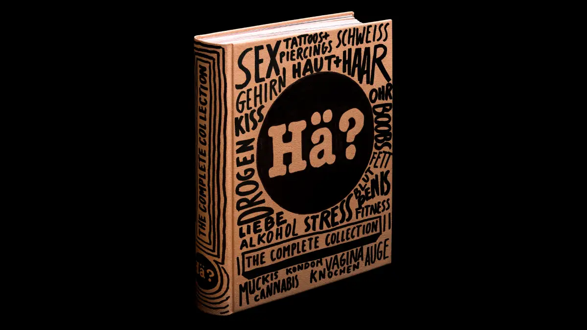

Writing A Scientific Article - A Step-By-Step Guide For Beginners
--
https://doi.org/10.1016/j.eurger.2015.08.005 <-- shared paper
--
https://doi.org/10.1002/bes2.1258 <-- shared paper
--
[older papers, but good guidance; we had all this in our university training, (hopefully) to good effect, but some reminders for us all, myself included!]
“Many young researchers find it extremely difficult to write scientific articles, and few receive specific training in the art of presenting their research work in written format. Yet, publication is often vital for career advancement, to obtain funding, to obtain academic qualifications, or for all these reasons. [They] describe here the basic steps to follow in writing a scientific article..."
#writing #technicalwriting #guidance #primer #research #scientificpaper #training #education #publication #career #publishorperish #academic #professional #scientific #article #format #structure #composition #components #elements #successful


Book Chapter in Civility Unbound
The idea of civility is predicated on a well-structured society that has norms that should benefit everyone. This essay questions whether such a society exists in the United States and whether what we call “civility” is simply a euphemism for “control.”
https://husseinrashid.com/2026/02/17/book-chapter-in-civility-unbound.html/
#Books #civility #comics #Publication #racism #ReligiousLiteracy

exposition… [agenda culturel]
avec un reportage photo et l'interview de Clément Chéroux et Romain Bernini*
“Romain Bernini” Voyages à Giphantie
à la Fondation Henri Cartier-Bresson, Paris
du 28 janvier au 3 mai 2026
#Publication Giphantie – Atelier EXB et Fondation Henri Cartier-Bresson
*Entretien avec Clément Chéroux, Directeur, Fondation Henri Cartier Bresson et Romain Bernini, par Anne-Frédérique Fer, à Paris, le 27 janvier 2026, durée 29’02, © FranceFineArt.
https://francefineart.com/2026/02/01/3685_romain-bernini_fondation-henri-cartier-bresson/
New publication out now!
🎤 Marcello Múscari, Ehler Voss & Martin Zillinger
📖 "Skill and Scale in Transnational Mediumship: Ethnographic Inquiries into New Communities of Practice and Enskilment"
🔗 Open Access: https://link.springer.com/book/10.1007/978-3-662-72097-4
We recommend!
#SFB1187 #MedienderKooperation #Publication #Scaling #Transnational #Mediumship #Ethnography #CultureStudies #OpenAccess

Pour plus d'informations sur la mer, ne ratez pas la #publication de @marinalocean.bsky.social et @bopplaurent.bsky.social > L'océan en 30 questions, paru à La Documentation française #ScienceCQFD
www.vie-publique.fr/catalogue/29...
L'océan en 30 questions
While the strain on academic #publishing is real, here is a monthly reminder to always respond to invitations for #PeerReview! Ignoring these messages just exacerbates the problem for everyone involved - let's not do that 💪 🔭 🧪
Enregistrement de mon nom de domaine Frimoulux.com https://tozounoir.zouluvo.com/enregistrement-de-mon-nom-de-domaine-frimoulux-com/
#site #internet #domaine #nom #hébergement #bande #annonce #vidéo #film #création #projet #image #graphisme #design #marketing #publication #contenu #média #blog #siteweb #sousdomaine #transfert #renouvellement #abonnement #passion #technologie #digital #créativité #portfolio #communication