
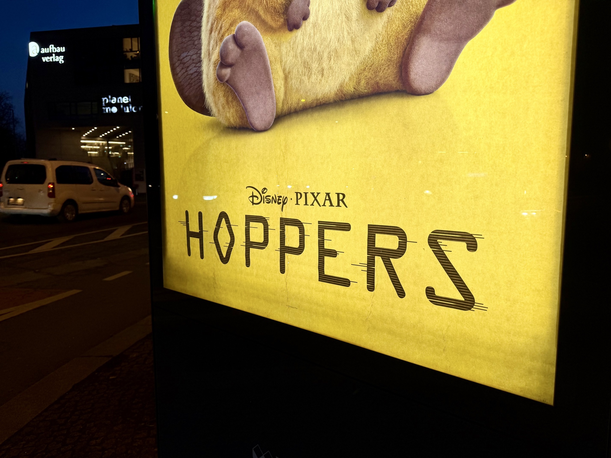
I’m intrigued by #Pixar & Disney’s #typographic choice for their new movie #Hopper: #OCR-A is a font from 1966 that was designed to “be recognised not only by the computers of that day, but also by humans.” (Wikipedia) Possibly a fit for a sci-fi story of human minds hopping into robotic animals.
#typographic
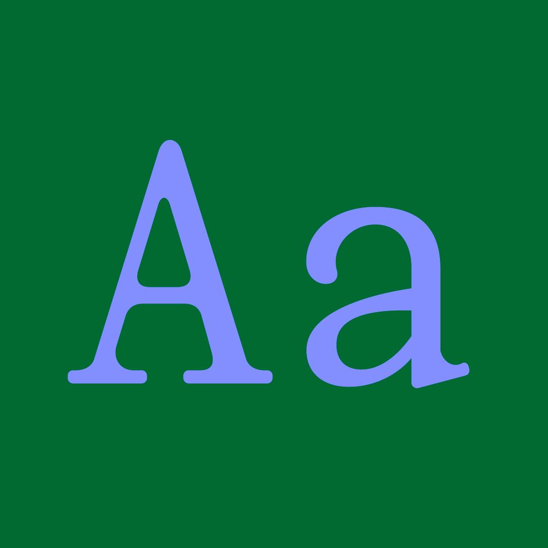
A
#mainz #mayence #reinhessen #rheinlandpfalz #germany #deutschland #europe #europa #a #asphalt #alphabet #buchstabe #typo #typografie #typography #typographic #typographie #typografi #street #streetphotography #bwphoto #bwphotograpy #photography #swfotografie #fotografie #banalography #raumstadtion

Several sketched concepts for the “Кайфёр” logo.
If I had to choose from those sketches I selected for further development at the first stage of the project, I’d definitely fall into a prolonged stupor.
#logo #logotype #lettering #process #sketch_daily #typo #typographic #logotipo #logoconcept


@BramMeehan Very nice work!
Maybe we're due a follow-up to the piece in BLAG 03 that profiled Rachel Joy (https://www.racheljoy.art),
Ben Johnston (https://www.benjohnston.ca), and Halfstudio (https://www.halfstudio.net).


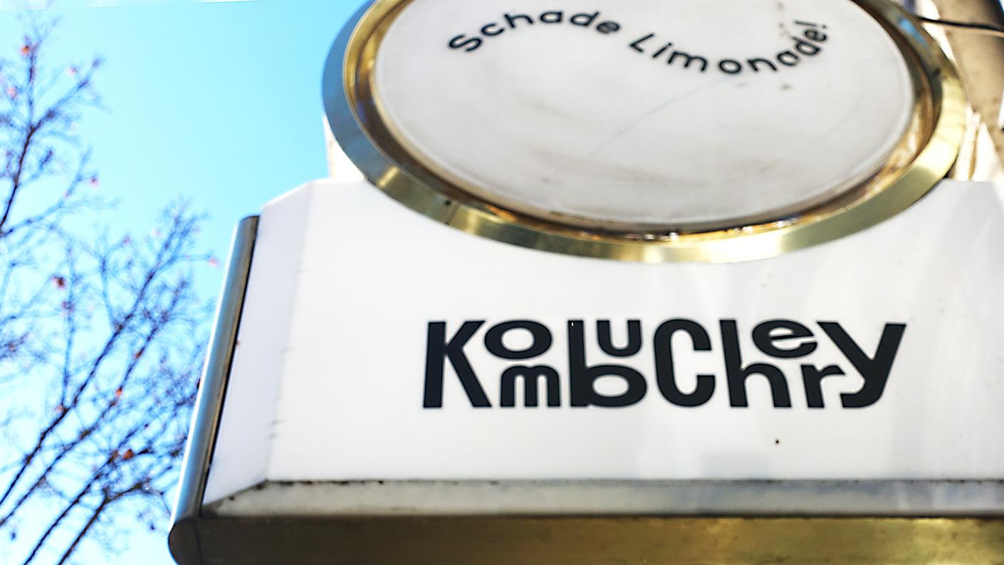
Soms kom ik speelse en wanordelijke #typografie op straat in #berlijn tegen die mij blij maakt | Sometimes I come across playful and disorderly #typography on the streets of #berlin that makes me happy.
#signing #typographic #typematters #fontlove #Typographymatters #typographyinspired #typographydesign #typographyart #typedesign #goodtype #WorldofType

KDE приятно удивляет. Про ввод расширенного набора символов при включённом: «extra typographic characters». Можно задействовать бесполезную клавишу в левом нижнем углу для использования символов третьего слоя («Level3 Shift»). Клавиша имеется если выбрана раскладка «Generic 105-key PC», актуально для тех, кому приходится ISO клавиатурами с раскладкой на 105/106 клавиш.
#KDE есть не только в линухах, но и во FreeBSD & OpenBSD, так что это очень неплохой подход к организации работы пользователя.
Так же можно посмотреть в графическом виде текущий вариант раскладки там же в настройках по каждому из Layouts в отдельности.
#типографика #typographic #клавиатура #keyboard @rur@social.sley.nl


🤩 NEW! Astra Nova by François Robert is a revitalized classic Americana display type he designed in 1969.
This new version precisely reproduces the overlapping grid, while expanding the glyph set, and language support, plus handy features like ligatures, stylistic alternates, symbols, and more.
Add pizzazz to titles, posters, logos, book & album covers, etc.
👉 Buy Astra Nova today at DelveFonts.com
#stars #vintage #grid #typeface #fonts #type #graphicdesign #typography #typographic


Some freshly rejected letters. Rejected by a client for a good reason (not legibility, I swear!), but too dear to be forgotten.
#typography #typedesign #typeface #typographic #type #contemporarytype #fonts #graphicdesign #typespire #letters #customfont #fontdesign #alttype
#typography #typedesign #typeface #typographic #type #contemporarytype #fonts #graphicdesign #typespire #letters #customfont #fontdesign #alttype


Overleden Paus verdient betere spatiëring van zijn uitgehouwen naam op zijn steen. Hemeltergend | Deceased Pope deserves better spacing of his carved name on his stone. Heaven forbid.
#handlettering #handtype #signing #typografie #typography #typographic #typematters #Typographymatters #typographydesign #font #typeface #letterspacing
![igs a"
«J ~
ie J
y i
i aa
©, NES
1 rs Mc
“A Ei
Ee es
3 Eo ..
= Bo
= -— B - -
= 3 = mz ad -
Teena a =
= yy : - -
= = r ar.
i > Be . -— Fa ~ - AT
; 2 5 - G x. ~, Ow ET
RN. I~ CC CC SS a >
—— A me me ¥
: as Rating ‘ HE ang LR ON as RT Le
: Ee ER a a - wk ER Cra -—
CR ae Tae Re oe =r om
Ea 2% a os RR a Rot Or We «= a -
Sot Spe eer - eV] AST Su \ i
er BRAS” Sia < TRL 2 i
- hg 3 iif 5 on
: Fa a AR .
: ] - ? rs » |
- 2 Fe ; :
. ’ 7 2 A a — -
: er at ’ : RETR Lr - aOR =a
he ae > ge om z . _ =
= 3 FI BAL Ay : ’ :
ry 5 9 go
ay EC
. OE ee i = ws a
\ ad i hel : Ee | Eu
: - 3 n - . mad
Ry TL TORS TV FOr I A](https://files.mastodon.social/media_attachments/files/114/415/896/863/806/637/original/e946fd04e52caec2.jpg)
Typographic Pictures Composed Entirely of Brass Rule (2024)
https://blog.glyphdrawing.club/typographic-pictures-composed-entirely-of-brass-rule/
#HackerNews #Typographic #Art #Brass #Rule #Typography #Design #Creative #Innovation
Typeface Straal
Regular, Italic, Mono
•
•
•
•
#typography #font #fontdesign #typeface #typedesign #type #graphicdesign #typografie #typefacedesign #typographicdesign #typo #typographic #contemporarytype

🟢 BOX 24/24 🟢
Special edition of my ‘36 Days of Type, 08’ letter-set.
24 boxes (signed and numbered), including 40 postcards (26 letters, 10 numbers, and 4 overviews).
....................................................................
Box Specifications:
— Editions: 24
— Signed & Numbered
— Box size: 15.5x11x2 cm
— Inside cover: Silk-screen print
....................................................................
Postcards Specifications:
— Post cards: A6 (10,5x14,85 cm)
— Printing techniques: full-color digital
— Paper: Tintoretto Gesso, 350 grams
— Printing: PeterPrint
....................................................................
#box #packaging #art #design #typography #lettering #graphicdesign #postcards #print #pixelfed #pixelfedart #printedpaper #typographic #digitalprint #graphicdesign #colorful #36daysoftype


🟢 New Postcards 🟢
Specifications:
— Post cards: A6 (10.5 x 14.85 cm)
— Printing techniques: Full-colour digital
— Paper: Tintoretto Gesso, 350 grams
— Printing: @peterprintnl
....................................................................
#art #design #typography #lettering #graphicdesign #postcards #arabicletters #print #pixelfed #pixelfedart #arabictype #printedpaper #typographic


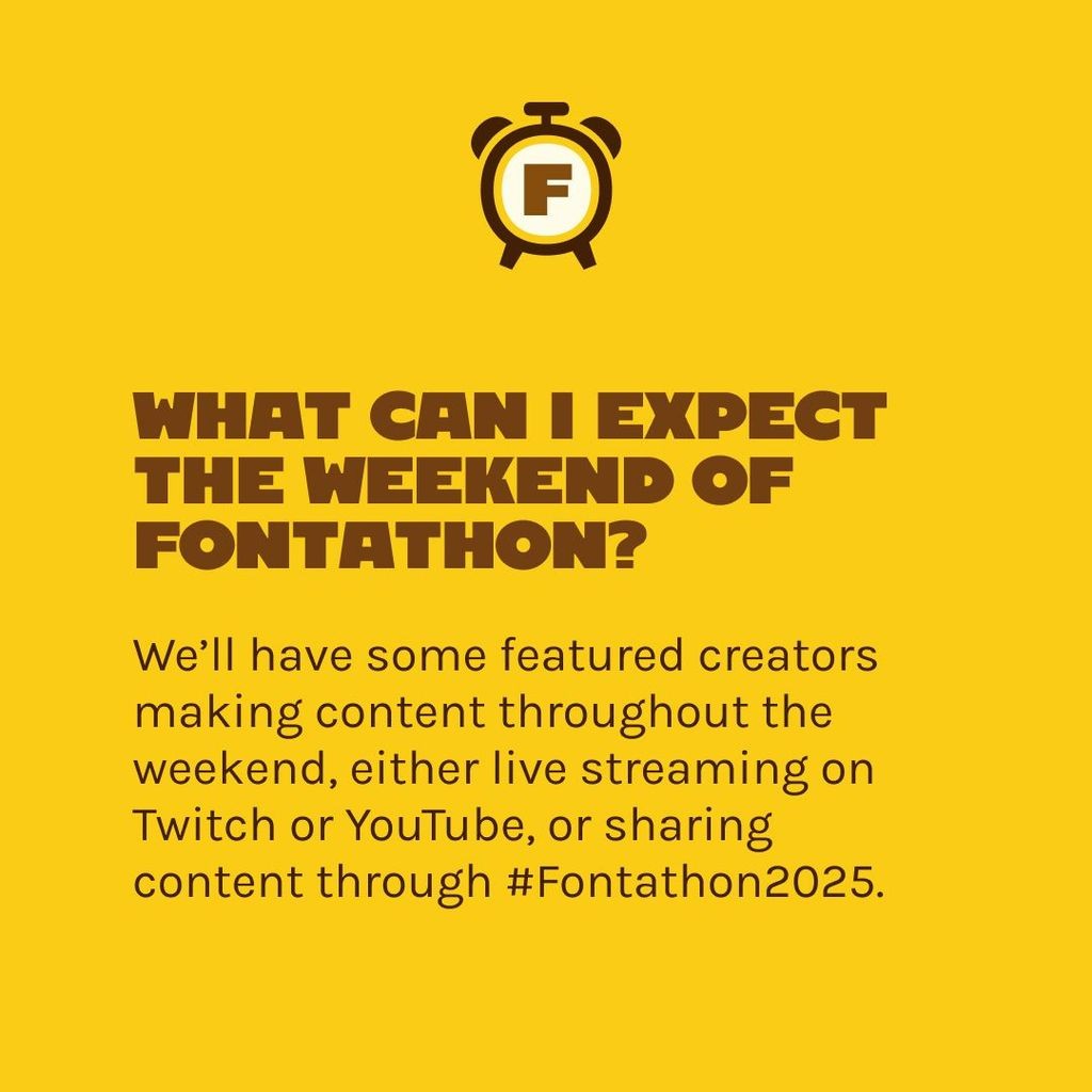
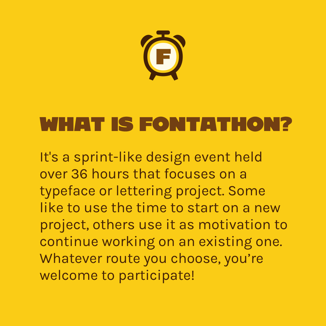
Fontathon is back again! Mark your calendars for 8–9 March 2025 for a fun weekend of non-stop type and lettering design.
#Fontathon2025 #Fontathon #type #typedesign #lettering #fontmaking #typesize #graphicdesign #fontstyle #UIandUX #UIdesign #UXdesign #TypeDesignClass #graphicdesign #graphic_designer #typespire #typedrawn #largetype #typedesigner #typematters #typographic #graphicdesigners #adobe #glyphsapp #glyphs3 #fontlabcom #fontself


It's 📈 >100% funded but there is still opportunity to back the project for 📕 ‘Type Archived: A visual journey through #Typographic history’ on 📚 Thames & Hudson Volume. ⤵
📕 #Type Archived: A visual journey through #Typographic history.
97% funded with 13 days remaining to back the project. ⤵️

Richard Rutter (@Richr) introduces TODS – a #Typographic and #OpenType default #Stylesheet.
“The idea is to set sensible typographic defaults for use on prose (a column of text), making particular use of the font features provided by OpenType.”
🍕 105 / A #typographic margherita
@fresh_fonts by @noemistauffer
Members: Quasar by #RaoulGottschling
Symphony by @playtype
Sub Sans by outofthedark.xyz
MD Lórien from @mass_driver_tm
Fonetika by @tokotype
Squil by @blackfoundry
#Foundries
https://bit.ly/FF_August2_24
Client Info
Server: https://mastodon.social
Version: 2025.07
Repository: https://github.com/cyevgeniy/lmst