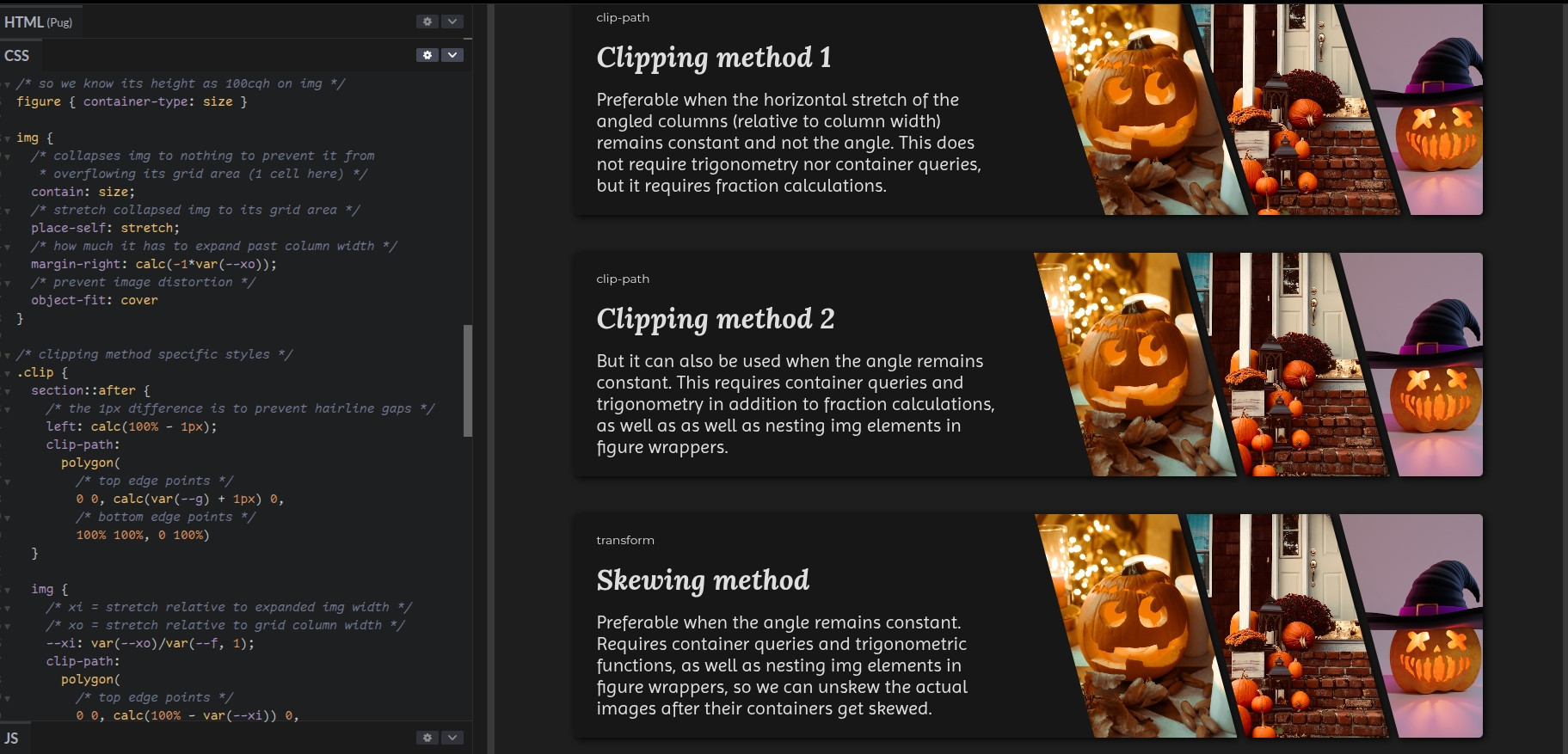
Simple pricing cards - a demo I made on @codepen: https://codepen.io/thebabydino/pen/ZYOJgyW
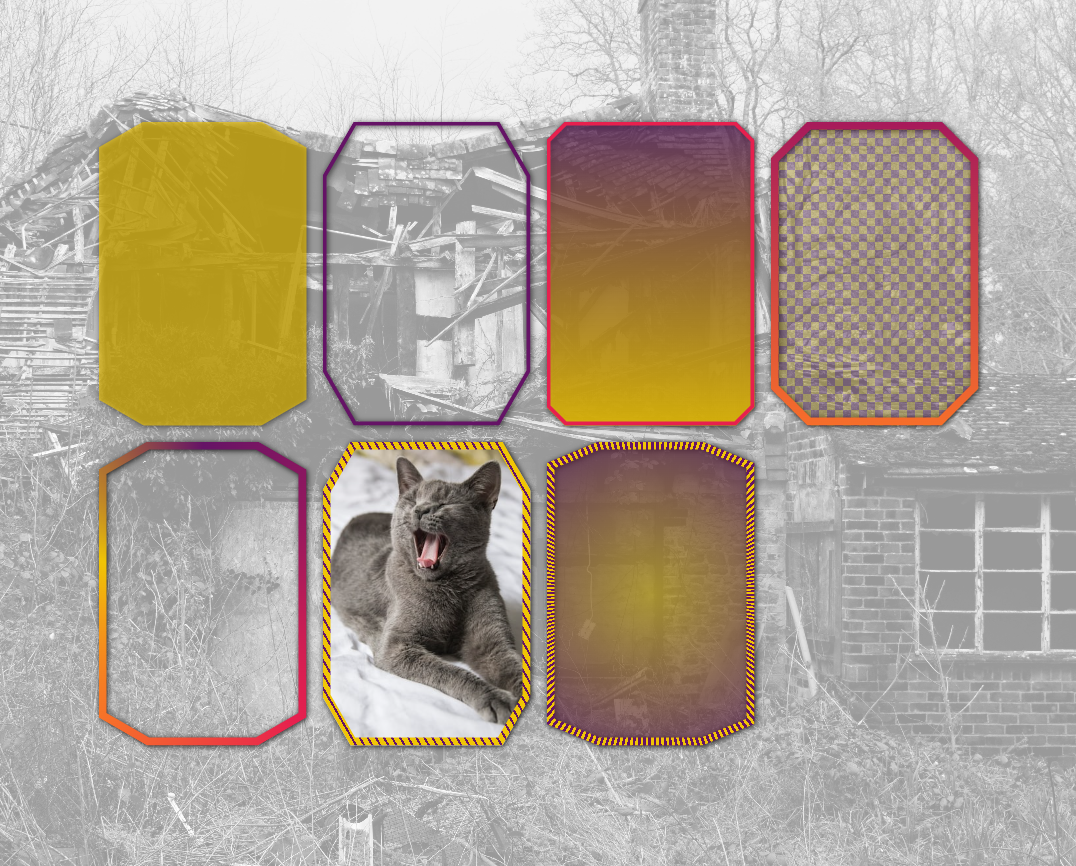
I've posted even cooler pure #CSS ones (non-rectangular shapes + rounded corners, glassmorphism + border effects combined) for Ko-fi & Patreon supporters:
❇️ https://ko-fi.com/anatudor/tiers
❇️ https://www.patreon.com/c/anatudor/membership
#cssGrid #cssClipPath #clipping #code #web #dev #webDev #webDevelopment #coding #frontend