#humanInterfaceGuidelines

2026-02-08

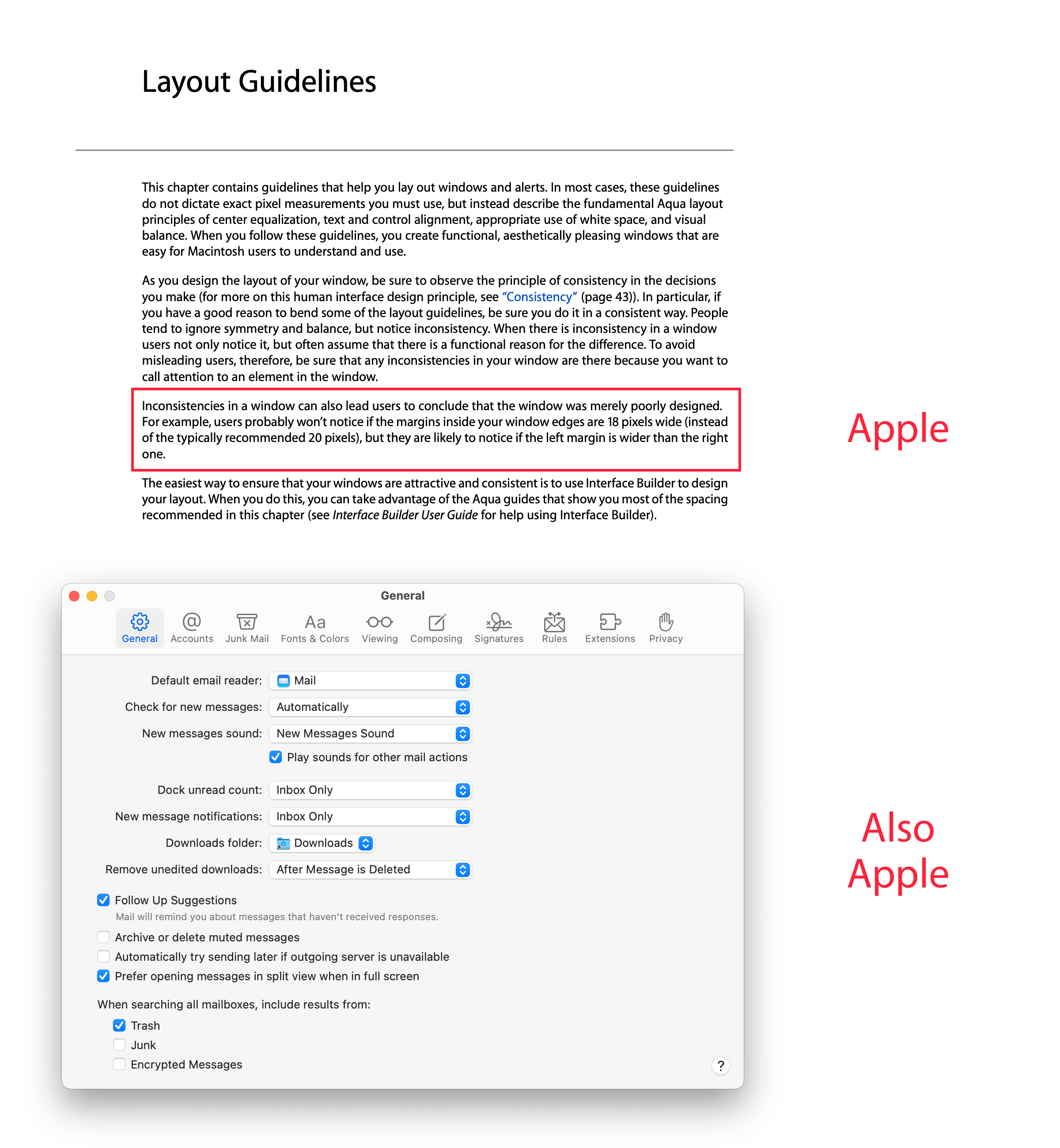
The inconsistency of Tahoe’s design

I even collected them all together, so the absurdity of the situation is more obvious.


It’s hard to justify Tahoe icons @ tonsky.me

Oh how the mighty have fallen.

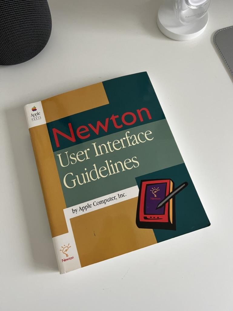
I recommend reading the whole post. It’s an opus to how Tahoe UX design is an utter denunciation of the Macintosh Human Interface Guidelines – once considered to be the gospel of how interface design must be done.

I know it’s beating a dead horse at this point

I know it’s beating a dead horse at this point. Tahoe is a complete disgrace when it comes to user interface design. I don’t want to conflate this as denouncing Liquid Glass – although I still have issues with it. It’s how Tahoe is the worst implementation of it to the point where Mac OS isn’t what it is supposed to be.

Anyway, here’s to hoping all the changes with the leadership is all going to bear fruit sometime soon.

I’ve also realized that I might skip a mac OS version for the first time ever, esp now that I’ve successfully reverted my Mac back to Sequoia.

#apple #hig #humanInterfaceGuidelines #macOs #userInterface #ux
Dr. Juande Santander-Velajuandesant@mathstodon.xyz
2026-01-08

@soapdog don’t have a link to the Newton OS Human Interface Guidelines?

#macOS #macOSTahoe #NewtonOS #HIG #HumanInterfaceGuidelines

2025-04-24

@TheGymNerd I believe @daniel meant that majority of the software doesnt have any #uidesigner or #uxdesigner, and most of #uidesign #uxdesign is done on #developer feelings. Sure, #gnome looks nice, but its mostly because everyone uses #advaita and follows more or less #humaninterfaceguidelines. About #accessibility, although I dont require it, you really notice it when the application was designed by "developers" when in games you cant even change the controls, or its Eclipse (java IDE) where you install plugins through help menu bar item.

Mario Guzmánmarioguzman
2024-07-13

I forgot I never uploaded the 2.0 HIG PDF to this folder either. I just added it for both iCloud & Dropbox. :)

mastodon.social/@marioguzman/1

2023-11-08

@owlyph @wakingrufus In fact, Apples #HumanInterfaceGuidelines state that it’s a design goal since iOS 7 to use as much screen real estate for content as possible. And that’s a good thing on a mobile platform with a small screen. In contrast to Windows (8 especially), #Apple has resisted the urge to impose desktop-suited UI principles on mobile and vice versa, but it seems for commercial reasons, they have given up on it, transporting #iOS #UX to the desktop.

Mario Guzmánmarioguzman
2023-10-10

Apple in their Mac HIG: “…users probably won’t notice if the margins inside your window edges are 18 pixels wide (instead of the typically recommended 20 pixels), but they are likely to notice if the left margin is wider than the right one.”

Also Apple... left-aligns the Mail Preferences window controls even though they want developers to practice “center equalization."

Client Info

Server: https://mastodon.social
Version: 2025.07
Repository: https://github.com/cyevgeniy/lmst