
Designing this fintech Transactions screen meant reducing cognitive load before adding features. I surfaced totals first, simplified time filters, and used restrained data visualization so users can confirm activity in seconds, not minutes. Trust in fintech starts with clarity, not complexity. What makes a transactions screen feel instantly reliable to you? #FinanceApp #eWalletApp #WalletApp #FintechApp #BankingApp
#fintechapp

Designing this My Wallet screen was about reducing cognitive load in a high-trust fintech context. I prioritized balance visibility, quick actions, and transaction clarity so users can scan, decide, and act in seconds. Every spacing and hierarchy choice supports confidence, not decoration. What’s the first thing you look for when opening a wallet app? #FinanceApp #eWalletApp #WalletApp #FintechApp #BankingApp

This fintech eWallet home screen was designed to reduce cognitive load, not showcase features. Balance visibility comes first, followed by the most common actions to support fast decisions. Familiar faces in transfers reduce friction and build trust through recognition.
What’s the first thing you’d simplify in a finance app?


Complete Guide to Cleo-Like AI App Development Cost
From intelligent chatbots to budgeting tools, uncover the AI app development cost and requirements to build an app like Cleo.
Read More : https://www.excellentwebworld.com/cleo-like-ai-app-development-cost/
#AIAppDevelopment
#FintechApp
#MobileAppDevelopment
#AppDevelopmentCost
#TechInnovation
#AppDevelopment
#StartupTech

Ensuring Robust Fintech App Security: Best Practices for Protecting User Data
Learn the best practices for securing fintech apps, from encryption to multi-factor authentication, ensuring user data remains protected and privacy is maintained. Read More
#fintechapp #fintechdevelopmentservices
#fintechsoftwaresolutions
#fintechsoftwaredevelopment
#fintechappdevelopmentservices
#fintechappdevelopment
#fintechappdevelopmentcompany
More Details: https://bit.ly/3Cz00U6

Transforming Android Fintech Apps with the Power of Biometric Authentication
Discover how biometric authentication revolutionizes Android fintech apps, enhancing security, user convenience, and trust in digital financial transactions. Read our article today for more information.
#fintechapps #fintechapp #fintechsoftwaredevelopment
#fintechsoftwaresolutions
#fintechsoftwaredevelopment
#AL #ML #biometricauthentication
More Details: https://bit.ly/3B1SRe6

The Role of AI in Fintech: Building Financial Advisor Apps for Smarter Investing
Discover the transformative role of AI in fintech, focusing on building AI-powered financial advisor apps. Learn how these innovations enhance smarter investing strategies and reshape the future of finance.
Visit us - https://ripenapps.com/blog/the-role-of-ai-in-fintech/
#Aiinfintech #fintechapp

Top 10 Fintech App Development Companies – All You Need to Know
Discover the top 10 fintech app development companies excelling in innovative financial solutions. Learn what sets them apart in the fintech industry. Read More
#FintechAppDevelopmentCompanies
#fintechappdevelopers
#FintechSoftwareSolutions
#Fintechappdevelopment
#fintechappdevelopmentcompany
#fintechapp development services
#fintechapplicationdevelopmentcom
More Details: https://shorturl.at/a9Fu7


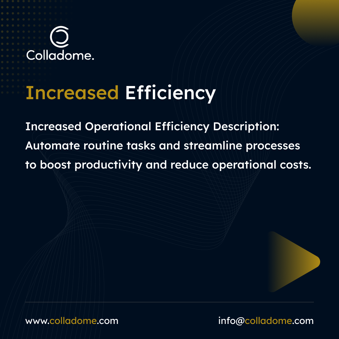
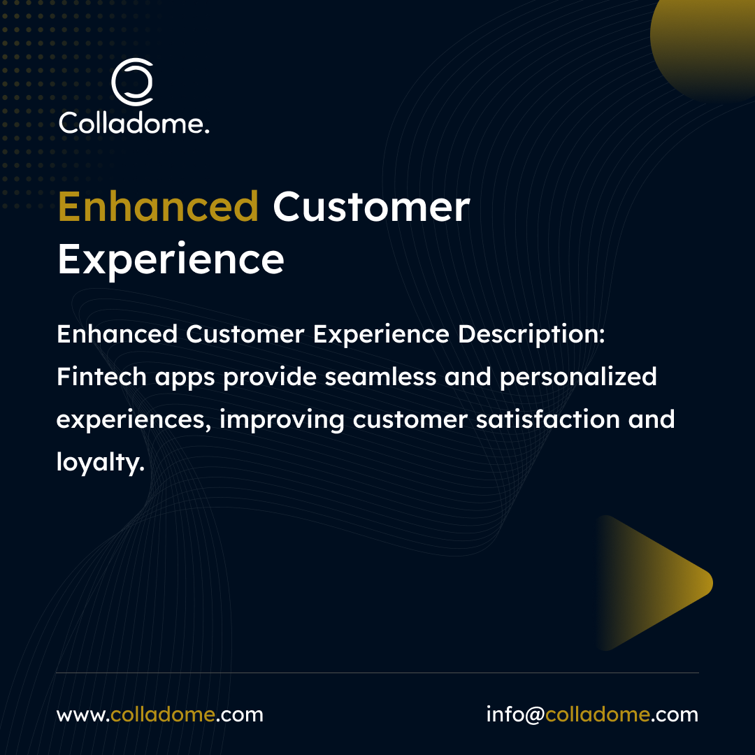
Explore the benefits of fintech application development for your business!
✅Enhanced Customer Experience
✅Operational Efficiency
✅Competitive Advantage
#fintech #appdevelopment #fintechapp #fintechsolution
Read our blog now!

Fintech Software Development Company For Your Business
#Fintech #FintechApp #FintechSoftware
https://www.ebizneeds.com/banking-and-finance

Referenced link: https://hackernoon.com/an-overview-of-the-fintech-industry-application-types-and-trends
Discuss on https://discu.eu/q/https://hackernoon.com/an-overview-of-the-fintech-industry-application-types-and-trends
Originally posted by HackerNoon | Learn Any Technology / @hackernoon@twitter.com: https://twitter.com/hackernoon/status/1567497957313839105#m
"An Overview of the Fintech Industry: Application Types and Trends" https://hackernoon.com/an-overview-of-the-fintech-industry-application-types-and-trends #fintechapp #fintechdevelopment
Referenced link: https://hackernoon.com/an-overview-of-the-fintech-industry-application-types-and-trends
Discuss on https://discu.eu/q/https://hackernoon.com/an-overview-of-the-fintech-industry-application-types-and-trends
Originally posted by HackerNoon | Learn Any Technology / @hackernoon@twitter.com: https://twitter.com/hackernoon/status/1563176957436895237#m
"An Overview of the Fintech Industry: Application Types and Trends" https://hackernoon.com/an-overview-of-the-fintech-industry-application-types-and-trends #fintechapp #fintechdevelopment

Fintech Mobile Application Development
#fintechapp #fintechapplication #fintech #trending #unitedstates #newyork #appdevelopment #webdevelopment

Client Info
Server: https://mastodon.social
Version: 2025.07
Repository: https://github.com/cyevgeniy/lmst