#blendMode

Ana Tudor 🐯anatudor
2026-01-14

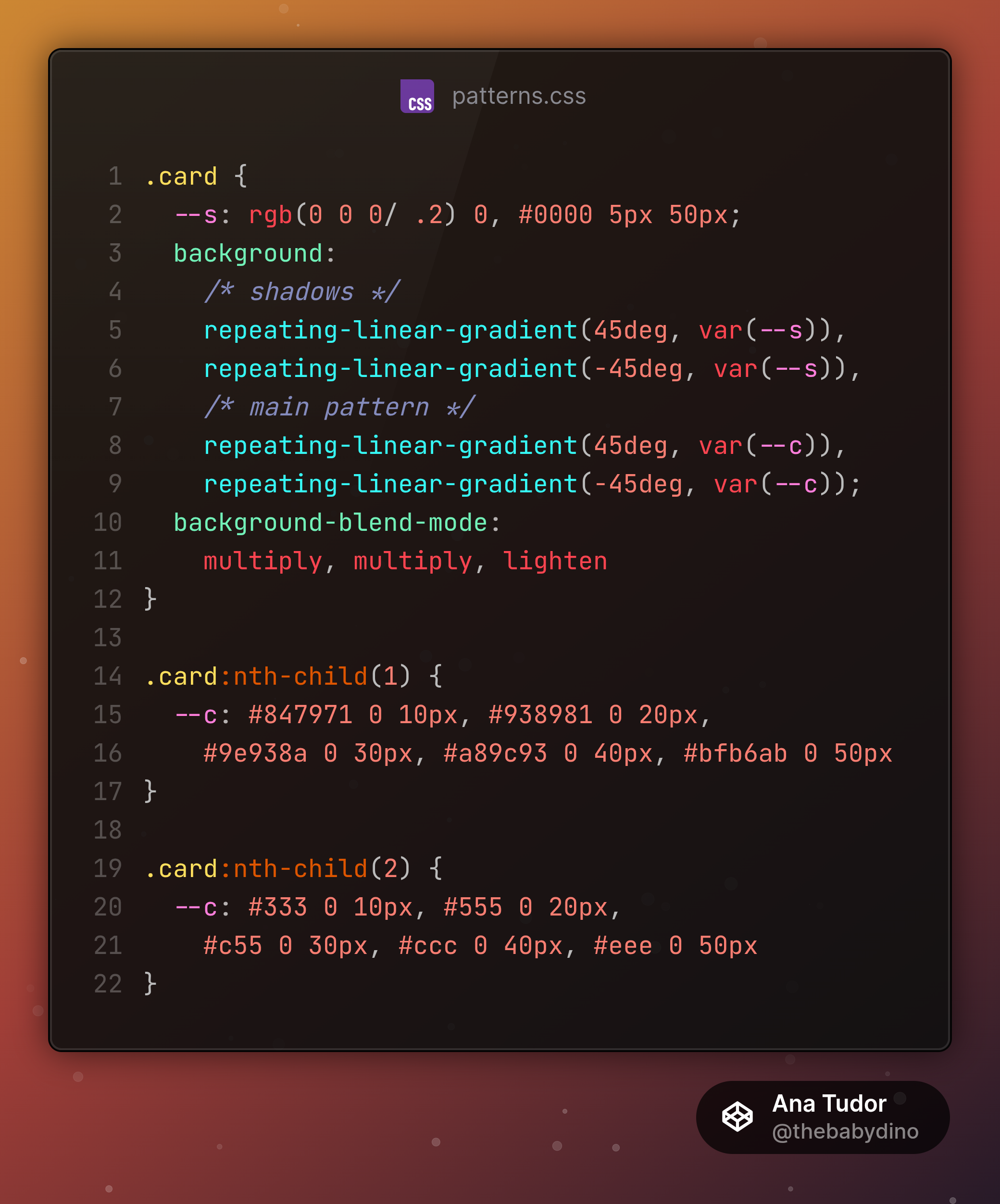
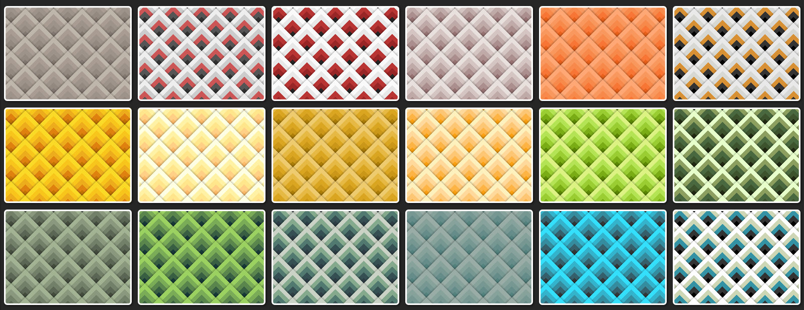
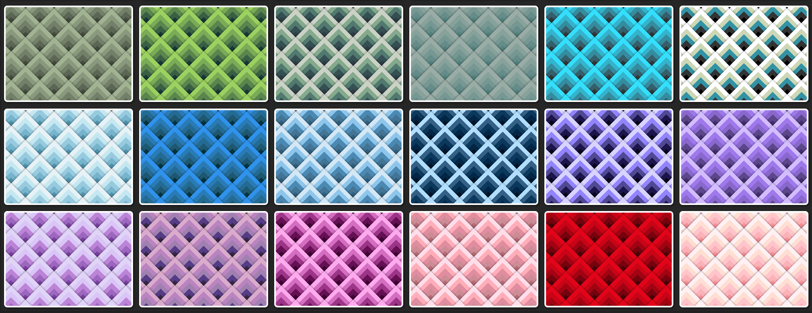
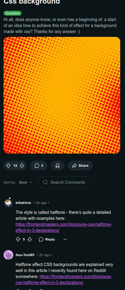
Beside the halftone part, it also uses the new and improved frame technique detailed in a previous post

mastodon.social/@anatudor/1158

Ana Tudor 🐯anatudor
2026-01-14

If you're a Cheetah+ supporter on Ko-fi or Patreon, then first of all thank you 🙏 and second, I've just published something detailing how to easily get halftone-masked images with blend modes and filters.

❇️ ko-fi.com/post/Halftone-maskin

❇️ patreon.com/posts/halftone-mas

Screenshot of the finished result highlighting the fact that the halftone masking is created from the code, no already masked images there.
Ana Tudor 🐯anatudor
2025-12-17

Single element, minimal (20 declarations and only that many to even out browser inconsistencies), minimal (just updates a custom property value), comparison slider (original image vs. desaturated one) on @codepen codepen.io/thebabydino/pen/MWM


Comparison slider screenshot. On the left, the original image. On the right, its desaturated version. In the middle, the draggable separator.
Ana Tudor 🐯anatudor
2025-05-13

Because this @codepen demo just got hearted and I've never shared it here before codepen.io/thebabydino/pen/Vwm

The concept behind the XOR is something I explained in this
@csstricks article css-tricks.com/taming-blend-mo

(should probably redo it with view transitions)

Ana Tudor 🐯anatudor
2025-04-12

You can find a very detailed explanation about the how behind in my Taming Blend Modes: `difference` and `exclusion` article on @csstricks css-tricks.com/taming-blend-mo

Screenshot of an interactive demo, highlighting how the `difference` blend mode works.
Ana Tudor 🐯anatudor
2025-04-12

And here are cards with gradual left to right inversion: from no inversion at all on the left, to full inversion on the right. Again, minimal code, single div, no pseudos necessary, 2 declarations.

Live demos on @codepen

✳️ codepen.io/thebabydino/pen/mdO

✳️ codepen.io/thebabydino/pen/dyO

.card {
  background:
		url(image.jpg) 50%/ cover, 
		linear-gradient(90deg, #000, #fff);
  /* or the difference blend mode */
	background-blend-mode: exclusion
}Original image: blue butterfly.Inverted image using the exclusion blend mode. The butterfly goes from its original blue on the left to red on the right, passing through a 50% grey.Pseudo-inversion of image using the difference blend mode. The butterfly goes from its original blue on the left to red on the right, this time passing through other hues rather than through a 50% grey.
Ana Tudor 🐯anatudor
2025-04-11

Here's another set of cards with varying patterns, all created with the exact same 4 blended CSS gradients, it's just the stops list `--c` that changes for each card.

So basically, it's again just one `background` + one `background-blend-mode` property.

Live demo on @codepen
codepen.io/thebabydino/pen/vYy

.card {
	--s: rgb(0 0 0/ .2) 0, #0000 5px 50px;
	background: 
		/* shadows */
		repeating-linear-gradient(45deg, var(--s)), 
		repeating-linear-gradient(-45deg, var(--s)), 
		/* main pattern */
		repeating-linear-gradient(45deg, var(--c)), 
		repeating-linear-gradient(-45deg, var(--c));
	background-blend-mode: 
		multiply, multiply, lighten
}

.card:nth-child(1) {
	--c: #847971 0 10px, #938981 0 20px, 
		#9e938a 0 30px, #a89c93 0 40px, #bfb6ab 0 50px
}

.card:nth-child(2) {
	--c: #333 0 10px, #555 0 20px, 
		#c55 0 30px, #ccc 0 40px, #eee 0 50px
}Up arrow card patterns.More up arrow card patterns.
Ana Tudor 🐯anatudor
2025-04-11

And here's a cards demo with a cool, yet very simple trick: these left to right gradients are vibrant at the top, but then progressively get more and more desaturated going down, until fully grey.

Live on @codepen codepen.io/thebabydino/pen/xxz - only 2 CSS declarations necessary!

Screenshot of demo with gradient cards, all showing left to right gradients, vibrant at the top of the card, but getting progressively more and more desaturated as we go towards the bottom..card {
  /* relevant code for the effect */
	background: 
		linear-gradient(90deg, 
        var(--stop-list)), 
		linear-gradient(#0000, grey);
	background-blend-mode: luminosity;

  /* other styles */
	aspect-ratio: 3/ 2;
	border-radius: .5em;
	box-shadow: 2px 2px 5px 1px #040404
}
Ana Tudor 🐯anatudor
2025-04-09

By the way, the code is heavily commented codepen.io/thebabydino/pen/MYW

So you can see how it works without JS, without wrapping individual elements into spans, just letting it wrap naturally. And without covers that wouldn't allow for an image backdrop behind the text.

Ana Tudor 🐯anatudor
2025-03-19

If we have an inline `span` inside a `p` & we give it a semi-transparent `background` + a `padding`, we get an alpha increase where backgrounds of adjacent lines overlap.

How would you solve this problem without text duplication, without stacking 2 identical `p` elements, one for background (opaque background + transparent text + opacity) and one for text (transparent background)?

The visual result showing four lines of text, middle aligned, each with its own semitransparent background and padding. The padding on each line leads to intersection, and where we have intersection, the semi-transparent background becomes more opaque.

The CSS producing this is:
```
p > span {
  padding: .25em;
  border-radius: 5px;
  background: rgb(0 0 0/ var(--a, .7));
  color: #fff;
  /* add lateral padding + border-radius to each line */
  box-decoration-break: clone
}
```
Ana Tudor 🐯anatudor
2025-03-18

Hi, mastodon 🦣 I have a new article out!

A Deep Dive into the Inline Background Overlap Problem: frontendmasters.com/blog/overl

How do you get the below result (semi-transparent background on inline span) with large padding & no overlap?

Answer in article, but think a bit about it first. 😼

✅ Desired result: consecutive line backgrounds overlap doesn't result in alpha increase and the text is always on top of the background, including that of adjacent lines.❌ Problem: by default, consecutive span lines with semi-transparent backgrounds have an increase in alpha at the overlap and the text on all but the last line is partly covered by the background of the next.
Ana Tudor 🐯anatudor
2025-03-04
Ana Tudor 🐯anatudor
2025-01-07

Pure 1 div halftone-masked background card codepen.io/thebabydino/pen/GRN on @codepen.

Made this 4 years ago - can you guess how before checking the code?

Doesn't work in Firefox due to an old bug 🪲 bugzilla.mozilla.org/show_bug. not even related to the halftone mask, but caused by the duo text on the right.

card with halftone mask on image on the left and duo text on the right (two lines of text, top one white, bottom one reddish)
Ana Tudor 🐯anatudor
2024-12-06

By the way, this is my second article for Frontend Masters.

My first was a few months ago and it was about creating dynamic split effects (image, text, page) without any content duplication whatsoever frontendmasters.com/blog/split

Ana Tudor 🐯anatudor
2024-12-04

I have a new article out: 🎇 Pure CSS Halftone Effect in Only 3 Declarations 🎇 frontendmasters.com/blog/pure-

This goes through the how behind the 3 declarations and then explores a lot of variations that help us produce 🌟 cooler, more interesting 🌟 patterns.

Ana Tudor 🐯anatudor
2024-10-30

A little @codepen demo I made some years back: a B&W image using pure (and very little code in total) codepen.io/thebabydino/pen/MWb

With a comparison slider between the two blend modes that may be used for the effect and a picker for duotone palette base.

Created for my Taming Blend Modes article css-tricks.com/taming-blend-mo

Ana Tudor 🐯anatudor
2024-09-27

Another request, mastodon 🦣

If you can test in Safari, can you let me know what the second (moving) line looks like for you?

codepen.io/thebabydino/pen/Jjg

Cyan like expected/ Chrome/ Firefox? Lime like what I'm seeing with Epiphany?

Boosts appreciated if you cannot test. Thanks! 🙏

Screenshot. Shows two lines of text, top one is stationary, bottom one is translated back and forth. The fixed one is always cyan, the moving one should be cyan too, but is lime in Epiphany.
Ana Tudor 🐯anatudor
2024-09-18

If you can test in actual Safari, could you let me know how this looks for you?

codepen.io/thebabydino/pen/Yzo

Like in the first screenshot or like in the second?

Thanks! 🙏

Screenshot, Chrome. Shows a paragraph with a hotpink link with a hotpink underline.Screenshot, Epiphany. Shows a paragraph with a greenish link with a hotpink underline.

Client Info

Server: https://mastodon.social
Version: 2025.07
Repository: https://github.com/cyevgeniy/lmst