
The cart screen is where intent meets hesitation. This design prioritizes clarity over persuasion: editable items, transparent price breakdowns, visible discounts, and a calm checkout CTA. The goal was to reduce doubt, not rush decisions. What usually causes users to pause before checkout in your product?
#UXDesign #EcommerceUX #ProductDesign #Ecommerce #EcommerceApp
#EcommerceApp

This eCommerce Fashion & Apparel Mobile App - Product Details Screen design started with one question: what is the fastest path from intent to action? I reduced cognitive load by prioritizing primary actions, grouping related elements, and removing decorative noise. The goal wasn’t beauty—it was clarity, speed, and confidence at every tap. What slows users most in your app today? #eCommerceapp #mCommerceapp #fashionapp #clothingapp #apparelapp

Designed this eCommerce Fashion and Apparel Mobile App - Home Screen by prioritizing discovery over control. Collections reduce decision fatigue, trending items add confidence, and visual hierarchy guides attention naturally. Every element exists to move users forward without overwhelm. What’s the first UX signal that tells you a shopping app is well designed? #eCommerceapp #mCommerceapp #fashionapp #clothingapp #apparelapp

Designing this eCommerce Marketplace Mobile App Seller Profile Screen was all about reducing friction. I focused on clean product discovery, a balanced card layout, and meaningful visual hierarchy so users can scan prices, ratings, and deals instantly. Every element supports faster decisions and smoother shopping. What would you improve on a seller profile screen?#eCommerceApp #MarketplaceApp #eCommerceMarketplaceApp #ShoppingApp #MultiVendorApp

Designed a clean eCommerce marketplace mobile app home screen focused on faster product discovery, reduced cognitive load, and a balanced visual hierarchy. Clear search, lightweight categories, and conversion-ready product cards streamline every interaction. What’s one UX detail you think most eCommerce marketplace apps overlook? #eCommerceApp #MarketplaceApp #eCommerceMarketplaceApp #ShoppingApp #MultiVendorApp


CS-Cart Mobile App brings your store to smartphones with smooth navigation, easy checkout, and better engagement.
#CSCart #EcommerceApp #MobileShopping #MobileApp #OnlineStore #Ecommerce
Nirmala Sitharaman GST Council Meeting Highlights: Key Tax Reductions and Exemptions Announced
#peopletalky #nirmalasitharaman #gst #reduction #ecommerceapp #ricekernel

https://itechnolabs.ca/ecommerce-app-development-company/
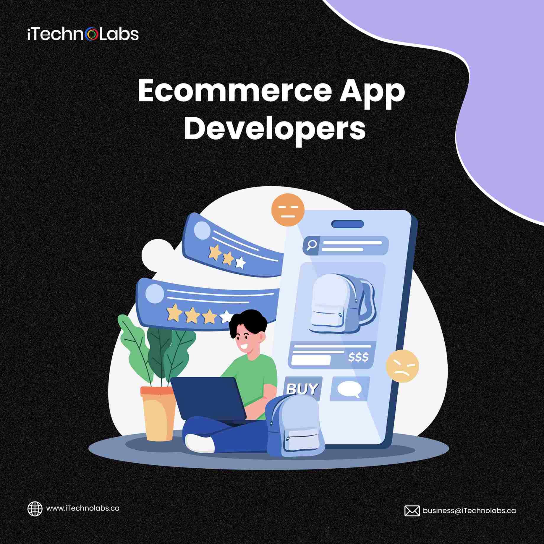
iTechnolabs offers custom eCommerce app developers to deliver unique solutions tailored to your business needs. Our expert team crafts secure, innovative, and user-friendly eCommerce apps that set you apart from the competition. Enhance your online store with personalized features and exceptional performance, all designed to boost your business success.
#ecommerce #ecommerceapp #ecommerceappdevelopers #ecommerceappdevelopment #ecommercedevelopmentcompany

Immersive Ecommerce App Development Company At Your Service
#EcommerceApp
https://www.ebizneeds.com/e-commerce-development

📬 Temu: Birgt E-Commerce-App gefährliche Malware?
#Datenschutz #Malware #Arkansas #ChristianLueg #ECommerceApp #PDDHoldings #Temu #TimGriffin https://sc.tarnkappe.info/1b6ba2
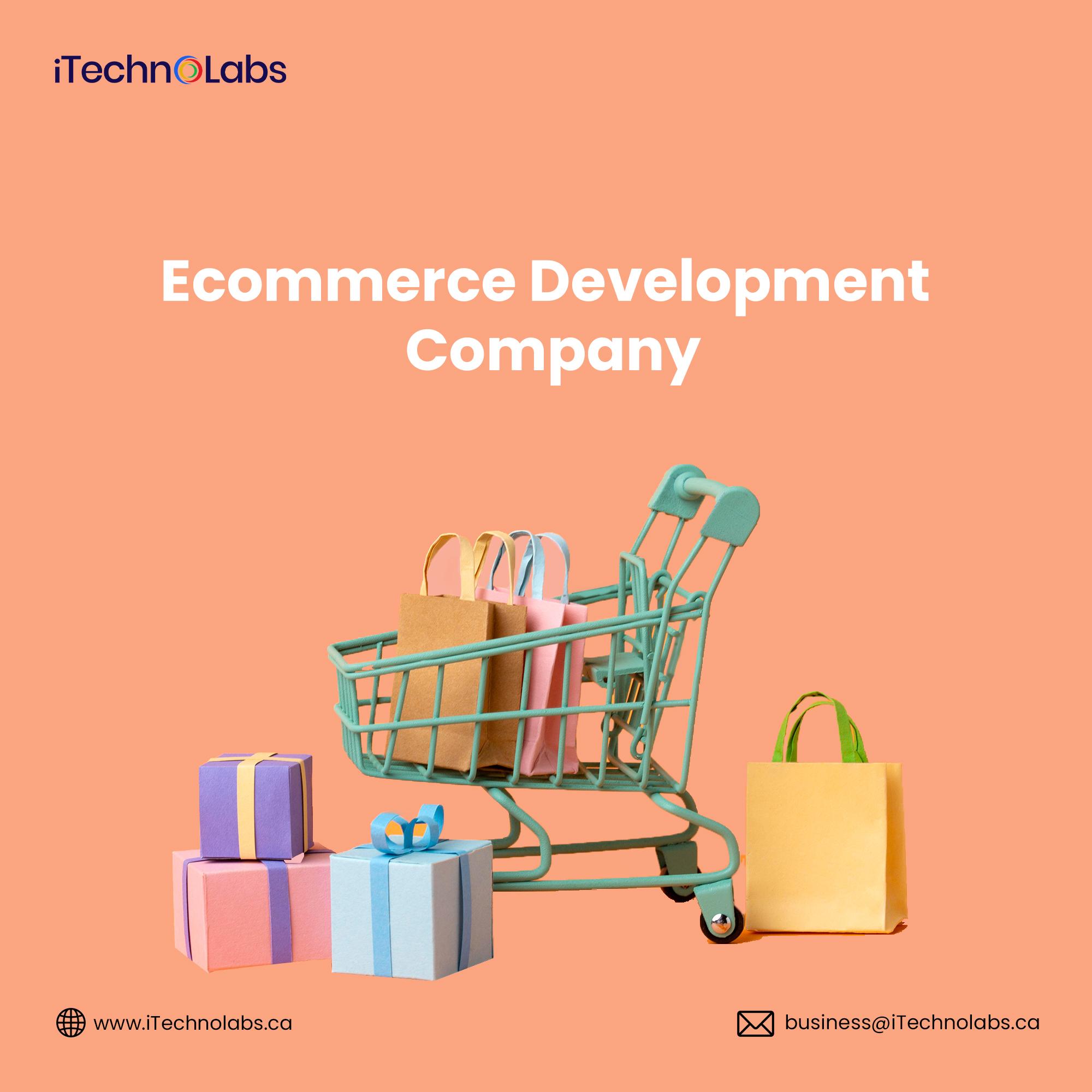
iTechnolabs is a certified e-commerce development company that delivers tailored solutions to businesses worldwide. With expertise in scalability, security, and user experience, iTechnolabs crafts platforms that drive growth and success in the digital marketplace.
Visit: https://itechnolabs.ca/ecommerce-app-development-company/
#ecommerce #ecommerceapp #ecommerceappdevelopment #ecommerceappdevelopers #ecommercedevelopment #ecommercedevelopmentcompany #itechnolabs
Types, Cost, and Monetization Strategies of eCommerce App Development
#eCommerceApp
https://www.ebizneeds.com/blog/cost-of-ecommerce-app-development/
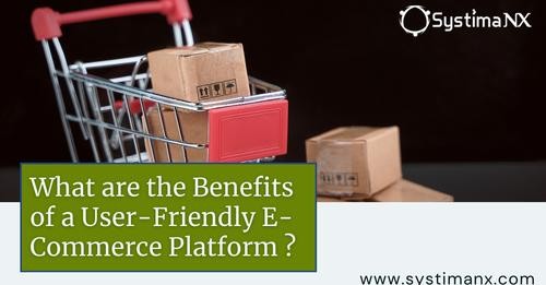
A user-friendly e-commerce web platform offers numerous benefits, including improved customer satisfaction, higher conversion rates, and enhanced brand reputation. With intuitive navigation and streamlined checkout processes, users are more likely to engage with the platform and complete their purchases, leading to increased sales and long-term success.
https://systimanx.com/blogs/benefits-of-creating-a-user-friendly-e-commerce-web-platform
#ecommerceapp #ecommerceappdevelopment #eommerceapplication #ecommerceapplicationdevelopment #technology

📱Mobile App Development companies have observed a 📈rise of $50 💰billion in revenues from apps in the first two quarters of 2️⃣0️⃣.2️⃣0️⃣.
Industries are replacing their working exposure under the digital technology methods, and app development companies gonna act as a medium to overcome such replacement with profit actions.
#mobile #app #development #mobileapp #mobileapplication #mobileappdevelopers #ecommerce #ecommerceapp #developer #androidplatforms #iosplatforms #developers #topmobileappdevelopers

Client Info
Server: https://mastodon.social
Version: 2025.07
Repository: https://github.com/cyevgeniy/lmst