#DesignForAll

Debby ‬⁂📎🐧:disability_flag:debby@hear-me.social
2025-12-13

🚨 The State Department’s Font Flip:
A Step Back from Accessibility 🧑‍🦯❌♿
—ditching accessible Calibri as "woke."

Earlier this week, the U.S. State Department announced its decision to abandon Calibri—the sans-serif typeface adopted under the Biden administration—in favor of Times New Roman. The internal memo framed this as a "return to consistency," but I see it as something deeper: a symbolic retreat that elevates tradition above accessibility, inclusivity, and the promise of open standards. As someone who values thoughtful design in public institutions, I find this choice disheartening, yet it compels us to examine what typography truly demands in a digital age.

Typography transcends mere aesthetics; it fundamentally shapes how we read, perceive authority, and feel included in vital conversations. When a government agency alters its typeface, that shift signals its core priorities. The reversion to Times New Roman, a serif font rooted in print-era conventions, risks turning typography into another cultural flashpoint. I sincerely hope this does not herald a broader precedent, but instead sparks a return to evidence-based decisions that serve every one.

From Courier to Calibri: A Brief History of State Department Fonts

The State Department’s typography has mirrored the evolution of bureaucratic communication. For decades, Courier New—a monospaced font introduced in 1955—reigned as the default, embodying the analog world of mechanical typewriters, carbon copies, and precise diplomatic cables. Its uniform spacing delivered egalitarian functionality, aligning every character perfectly for legal drafts and official forms.

In the 1980s and 1990s, as computers reshaped offices, Times New Roman took over. Crafted in 1931 by Stanley Morison for The Times of London, this serif typeface excelled in dense newspaper columns and fine print, projecting the conservative professionalism suited to diplomacy. Yet it was engineered for ink on paper, not the glowing pixels of screens that define our era.

By the early 2000s, legibility studies championed sans-serifs like Arial and Calibri for digital dominance. In 2023, the Biden administration embraced Calibri precisely for its superior on-screen clarity, accessibility, and visual ease—aligning with best practices from the GSA and Department of Education. Part of the humanist grotesque family (think Helvetica's lineage, tracing back to Akzidenz-Grotesk in 1898 or Highway Gothic on U.S. road signs since 1948), Calibri marked genuine progress. The sudden pivot back to Times New Roman strikes me as nostalgia over necessity, undermining hard-won advances in inclusive design.

The Return to Times New Roman: Symbol Over Substance

Officials tout this revert as tradition preserved, but I contend tradition must yield to accessibility. Serif fonts shine in print, yet on modern screens—especially low-resolution or small displays—they falter for those with low vision or dyslexia. The British Dyslexia Association and Bainbridge Group on Visual Legibility affirm that sans-serifs, with their clean, uniform strokes, ease reading and curb fatigue across diverse users.

Consider Times New Roman's subtle distinctions between "I," "l," and "1"—they blur digitally, inviting confusion. Bainbridge and MIT’s AgeLab research underscores how uniform strokes and open apertures accelerate comprehension in electronic documents. By clinging to this proprietary relic, the State Department bypasses free, open-source gems like IBM Plex, Source Sans, or Lato, which offer transparency and adaptability. Thailand’s 2006 font competition, producing 13 national standards, proves governments can innovate boldly. This choice feels like a step backward, favoring the familiar over forward momentum.

The Science and Soul of Accessible Typography

Accessible typography is human-centered design at its core, backed by decades of research into font shapes, spacing, and character clarity for all readers, impaired or not. Fonts like OpenDyslexic, with weighted lower halves to prevent letter inversion, and Atkinson Hyperlegible, which sharpens distinctions between confusable characters like 0/O or 6/b, lead the way. Developed by the Braille Institute of America with Applied Design Works, Atkinson enhances accuracy and speed for dyslexic and neurotypical alike, all without aesthetic compromise.

Here’s my personal preference: Atkinson Hyperlegible is my favorite—it captures the open, modern inclusivity government design demands. Best of all, its SIL Open Font License makes it free and available for public, governmental, and educational use, unlike the corporate shackles of Calibri or Times New Roman.

Why Accessibility Matters in Public Typography

For institutions like the State Department, clarity is no luxury—it's a democratic imperative. Diplomats, journalists, and citizens alike deserve documents free of strain, legible across aging eyes, reading differences, and global devices. Times New Roman, born for 1930s newsprint, dismisses these truths, broadcasting detachment from digital realities. Accessibility isn't political posturing; it's practical humanity, the bedrock of public-spirited communication.

---
References

- British Dyslexia Association. Dyslexia Style Guide 2022: Creating Dyslexia-Friendly Content.
- Braille Institute of America. Atkinson Hyperlegible Study. (2021).
- Bernard, M. et al. “A Comparison of Popular Online Fonts: Which Size and Type is Best?” Usability News, Wichita State University (2003).
- Morison, S. A Tally of Types. Cambridge University Press (1939).
- MIT AgeLab. “Typography and Visibility on Digital Displays.” (2014).
- Shaikh, A. (2007). “Impact of Typeface Design on Legibility and Reading Comprehension.” Behavior & Information Technology.

#InclusiveDesign #StateDepartment #Courier #TimesNewRoman #Calibri #A11y #Typography #Accessibility #A11yMatters #DesignForAll #WebA11y #StateDeptFontFail #FOSS

Image with Text: 🚨 The State Department’s Font Flip: 
A Step Back from Accessibility 🧑‍🦯❌♿
—ditching accessible Calibri as "woke." 
 
 Courier introduced in 1955 as the State Department’s default. 
Originally designed for IBM typewriters, the Courier typeface 
is now in the public domain.

 Times New Roman (1980s–2023) became the State Department standard 
with the rise of word processors. 
Designed in 1931 by British typographer Stanley Morison for The Times of London.

 Calibri (2023–2025) served as the State Department standard. 
Part of Microsoft Office and designed by Lucas de Groot, it replaced Times New Roman 
to improve on-screen readability.

Fraktur coming soon?

 Times New Roman reinstated as State Department standard from 2025 
to counter a so‑called “woke” font choice.

The text is presented in a clean, simple style each paragraph in is set in the fame font it describes against a dark background.
graeme fawcettgraeme@tech.lgbt
2025-11-28

Am I silly?

Am I serious?

Is there actually a difference?

Does there need to be?

#engineering #humantools #designforall #designforexcellence

When the end and the means are both this good, I don't think it does
OS-SCIos_sci
2025-10-26

Edit like a pro, pay like a boss—nothing! 𝗚𝗜𝗠𝗣 puts powerful, open-source image editing in your hands. No subscription, just creativity. 🎨
os-sci.com

OS-SCIos_sci
2025-10-04

AI power shouldn’t be locked behind paywalls! 🚀 The open-source alternative (GIMP) puts professional-grade image editing in everyone’s hands—no subscription, no limits. Create freely, share openly.
os-sci.com

Better Edit Worksbettereditworks
2025-05-27

Design that includes is design that inspires. ✨ Accessibility isn’t a limitation—it’s the secret to truly impactful aesthetics. ♿🎨💡

Angōzi Al-Ma’arriangozi@veganism.social
2025-01-18

Rather than creating hostile architecture, why not design spaces that allow birds and other animals to share our environment peacefully and safely? Coexistence doesn’t have to compromise our quality of life. #DesignForAll #EcoFriendly #VeganArchitecture

TalkBitztalkbitz
2024-09-10

🎨📈 Boost your graphic design skills in 2024 with Canva Pro!

🚀 No design experience needed to create stunning visuals.

🔗 social.talkbitz.com/ysf4a

WordPress Accessibility Daywpa11yday@wptoots.social
2024-08-19

As #WPAD24 gear up for our event on Oct 9th, we're inspired by #id24. Our shared goal is to work toward a more accessible world! Inclusive Design 24 is a Free 24-hour online event on Sept 12. For more info: inclusivedesign24.org/2024/ #InclusiveDesign #Accessibility #DesignForAll #WebAccessibility #WPA11yDay #WPAD2024 #accessibility #a11yEvents

Discover My Europenowtheblog
2024-06-07
Colladome IT Network Solutionscolladome
2024-04-26

🌟 Excited to share insights on "Designing for Accessibility: How Inclusive UX Improves User Engagement" 🌟

Join us as we explore the transformative power of inclusive design in enhancing user experiences! In today's digital landscape, accessibility isn't just a checkbox—it's a fundamental aspect of user-centric design.

Read more at: zurl.co/ZPvJ

2023-07-10

🧭 Unsere Indoor-Navigation #everGuide ist nun auch im Karl-Bröger-Haus in
Nürnberg im Einsatz! Am Wochenende haben wir die #designforall App beim Tag der offenen Tür vorgestellt.

ℹ️ Mehr Infos: karl-broeger-haus.de/barrieref

fokus.fraunhofer.de/go/indoor-

Ein Forscher, männlich mit Bart, steht vor einem großen Fernsehbildschirm. Er hält ein Smartphone und einen Sensor, der aus einer flachen, quadratischen Fläche besteht in der Hand. Zu seinen Füßen steht ein kniehoher Roboter. Die obere Hälfte des Roboters besteht aus einer Kamera, welche auf einem Stab montiert ist. Auf dem Fernsehbildschirm ist eine 360-Grad-Aufnahme des Roboters zu erkennen, in welcher auch der Forscher zu erkennen ist.Frontale Außenansicht des Karl-Bröger-Hauses in Nürnberg, ein rostrot gefärbtes Gebäude mit etwa 7 Stockwerken..
Waves Fashion Institutewifd
2023-05-23

𝐈𝐥𝐥𝐮𝐦𝐢𝐧𝐚𝐭𝐢𝐧𝐠 𝐀𝐜𝐜𝐞𝐬𝐬𝐢𝐛𝐢𝐥𝐢𝐭𝐲: 𝐃𝐞𝐬𝐢𝐠𝐧 𝐚𝐧𝐝 𝐃𝐞𝐯𝐞𝐥𝐨𝐩𝐦𝐞𝐧𝐭 𝐟𝐨𝐫 𝐕𝐢𝐬𝐮𝐚𝐥𝐥𝐲 𝐈𝐦𝐩𝐚𝐢𝐫𝐞𝐝 𝐈𝐧𝐝𝐢𝐯𝐢𝐝𝐮𝐚𝐥𝐬

Learn how innovative technologies and user-centered approaches are revolutionizing accessibility, enhancing independence, and fostering equal opportunities for the visually impaired community.

wifd.in/design_and_development

𝐈𝐥𝐥𝐮𝐦𝐢𝐧𝐚𝐭𝐢𝐧𝐠 𝐀𝐜𝐜𝐞𝐬𝐬𝐢𝐛𝐢𝐥𝐢𝐭𝐲: 𝐃𝐞𝐬𝐢𝐠𝐧 𝐚𝐧𝐝 𝐃𝐞𝐯𝐞𝐥𝐨𝐩𝐦𝐞𝐧𝐭 𝐟𝐨𝐫 𝐕𝐢𝐬𝐮𝐚𝐥𝐥𝐲 𝐈𝐦𝐩𝐚𝐢𝐫𝐞𝐝 𝐈𝐧𝐝𝐢𝐯𝐢𝐝𝐮𝐚𝐥𝐬

Discover the transformative power of inclusive design and development for visually impaired individuals. Learn how innovative technologies and user-centered approaches are revolutionizing accessibility, enhancing independence, and fostering equal opportunities for the visually impaired community.
2023-02-21

Sick of Chatbots? Me too! So I wrote about 4 speed bumps that could improve creation, use, and consumption of content from Generative AI.

medium.com/@blinkpop/can-these

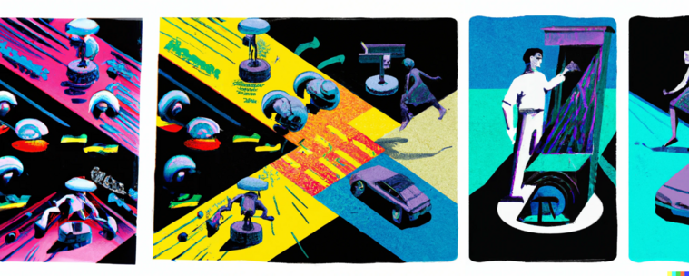
Dall.e generated image prompt: Magazine illustration for article titled "Can these 4 speed bumps improve generative AI?"
Kathy Baxterbaxterkb
2023-01-18

"What if technology defaulted to instead of tricks? What would it look like if technology was embedded with features that prioritized things like , , and ?" - Paula Goldman, Chief Ethical & Humane Use Officer at


techcrunch.com/sponsor/salesfo

Kathy Baxterbaxterkb
2022-12-18
VCÖ - Mobilität mit Zukunftvcoe_mobilitaet_mit_zukunft@wien.rocks
2022-12-08

Täglich ein #Goodpractice-Beispiel, heute: Die niederländische Stadt Breda, wo #Barrierefreiheit und #DesignforAll die Norm der Verkehrsplanung und Stadtplanung ist

hle anzeigen
Nachrichten
Bildbeschreibung
Die niederländische Stadt Breda verfolgt das Prinzip Design for All: Barrierefreiheit wurde so in der Stadt zur Norm. Bei der Planung neuer Projekte werden Menschen mit Behinderung aktiv in jeder Phase eingebunden. Die Zugänglichkeit von über 800 Geschäften und Gaststätten wurde überprüft und wenn nötig verbessert. Der neue Bahnhof ist vollständig barrierefrei gestaltet. Menschen mit Behinderungen stehen barrierefreie Kleinbusse und elektrische Rollstühle zur Verfügung, um ihnen die Fortbewegung in der Stadt zu erleichtern. Alle Busse und Bus- haltestellen sind stufenlos zugänglich und auch digitale Informationen und Navigations-Apps für Smartphones sind barrierefrei gestaltet
Andi WagnerAndi_Wagner
2022-10-31

@afelia Ja, öffentliche Räume und Dienstleistungen gehören so gestaltet, dass sie nutzbar für alle sind!

Client Info

Server: https://mastodon.social
Version: 2025.07
Repository: https://github.com/cyevgeniy/lmst