The Nile basin.
#rayshader adventures, an #rstats tale

An arboreal, poly, gender non-participating mapmaker and cat foster. I like to share my process, write tutorials, and otherwise informally teach cartography (with support from many of you on Patreon).
New set of Du Bois reproduction. #Dataviz
https://github.com/ajstarks/dubois-data-portraits/blob/master/challenge/2026/README.md

Monday #Map: Round Islands (2017). There are many "round islands" in the US & Canada. Most of them are not particularly round.
Blog post with PDF download: https://somethingaboutmaps.wordpress.com/2017/11/30/a-collection-of-round-islands/


If you're interested in acquiring a box of 150 Projection Collection cards (no longer for sale, but from my secret supply), I'm holding a raffle to support the Washington Post 2026 layoff fund (https://www.gofundme.com/f/standing-together-for-guild-colleagues). Open to those who donate in the next 24 hours (until Tuesday, 7pm Central Time). The more you donate the more chance you have to win.
Details here: https://forms.gle/iMNB3kZyQVbVspzg8

@nyalld It's surprising, to be sure. This map contains errors of the sort that I'd usually see him pointing out in the works of others.
At the start of the project, they ask: "So… can we encourage better mapping through developing an awareness of how to use AI to make a half-decent map? and can we work towards establishing best practices through our experimentation?"
But I don't see many examples of their daily posts discussing any sort of "best practices" or examining the output of their prompts.
https://mapdesign.icaci.org/2025/12/the-365-day-map-challenge/
Every day, the International Cartographic Association's (ICA) Commission on Map Design posts a new (often inaccurate) AI-generated map. I have been unable to understand how this serves the cartographic community or the ICA's goals. I have tried asking them questions about their objectives, but never gotten a reply.
https://mapdesign.icaci.org/category/365daysofmaps/
Seems harmful to our field's reputation to put out AI slop without even critically examining it.
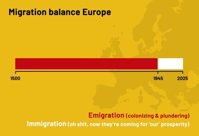
Powerful Imagery at the Intersection of Political Cartoons & Infographics #ABlueView 1/2
In the series 'Ratios', https://twp.ai/bXZHlK visually represents proportions & magnitudes from today's world as simply as possible. A series at the intersection of cartoons & infographics.


@jeremy Thanks so much! I haven't actually seen it in print, myself, but I should give it a try some day.
@maproomblog That map at the top of the article is lovely and I want to try and reconstruct it.
New post: The Peoples of North America in 1776 https://www.maproomblog.com/2026/02/the-peoples-of-north-america-in-1776/
New post: The Cold War Seen Through Polar Projections https://www.maproomblog.com/2026/02/the-cold-war-seen-through-polar-projections/
New post: The Business of Selling Map Prints https://www.maproomblog.com/2026/02/the-business-of-selling-map-prints/
A few years ago I made this poster and released it as a free PDF (https://somethingaboutmaps.wordpress.com/2022/12/19/projection-connections-a-very-nerdy-poster/). This week, I learned from a colleague that it has actually been posted in an educational setting!


I just set up a DOS-based virtual machine recently, and I must say, it's so pleasantly simple and clean. Now if only it could run QGIS.
Johannes Gutenberg: I've invented this printing press.
Printing press: You're out of magenta.
New on the blog: "Financial Transparency: Print Sales Edition"
In which I explain my experience in the business of selling maps online.
https://somethingaboutmaps.wordpress.com/2026/02/02/financial-transparency-print-sales-edition/

@J9C Thanks so much!
Monday Map: King Eider. In 2016–17 I made about 130 maps for an atlas produced by Audubon Alaska. This is one of the best of them, I think.
Free atlas download: https://ak.audubon.org/conservation/ecological-atlas-bering-chukchi-and-beaufort-seas


New on the blog: "Financial Transparency: Print Sales Edition"
In which I explain my experience in the business of selling maps online.
https://somethingaboutmaps.wordpress.com/2026/02/02/financial-transparency-print-sales-edition/