
⚫︎⚫︎⚫︎ My new @sportsfonts release Winner Scoreboard is just an LCD typeface, but I had the feeling that there are a few interesting things to share about it:

Jürgen Siebert :CommentTypo:
PAGE 1986–1991, FontFont, FUSE, FontBook 1991–1993, FontShop 1993-2014, TYPO 1995–2016, Monotype 2014–2020, hitext 2020 – today. Dedicated to #design + #typography + #culture, and how it fits together.
@gerritvanaaken Rein visuell: bei den Grünen.
@schriftprobenBot @grautesk It was an honour for me to digitise that wonderful Fanfare-ck ligature and combine it with the digital Fanfare (Louis by Canada Type) for my Book “Brücke am Kanal”

Jürgen Siebert :CommentTypo: boosted:

Let's save Das Baumhaus Berlin! "The tree house" is such an extraordinary place far from my Kiez though but still worth saving, thanks Scott and the team for your work! Please everyone have a look, support and spread the word!
@gabrowitsch @elliotjaystocks Bücherbogen https://www.buecherbogen.com
Within two weeks, traffic priorities in Berlin have been clarified as follows:
❶ Cars (snow- and ice-free since day 1)
❷ Pedestrians (icy, gritted for 2 days)
❸ Bicycles (snow-covered and icy)

I can’t imagine a better April Fool’s joke.
https://www.lego.com/en-us/aboutus/news/2026/january/the-lego-group-and-crocs-enter-multi-year-global-partnership
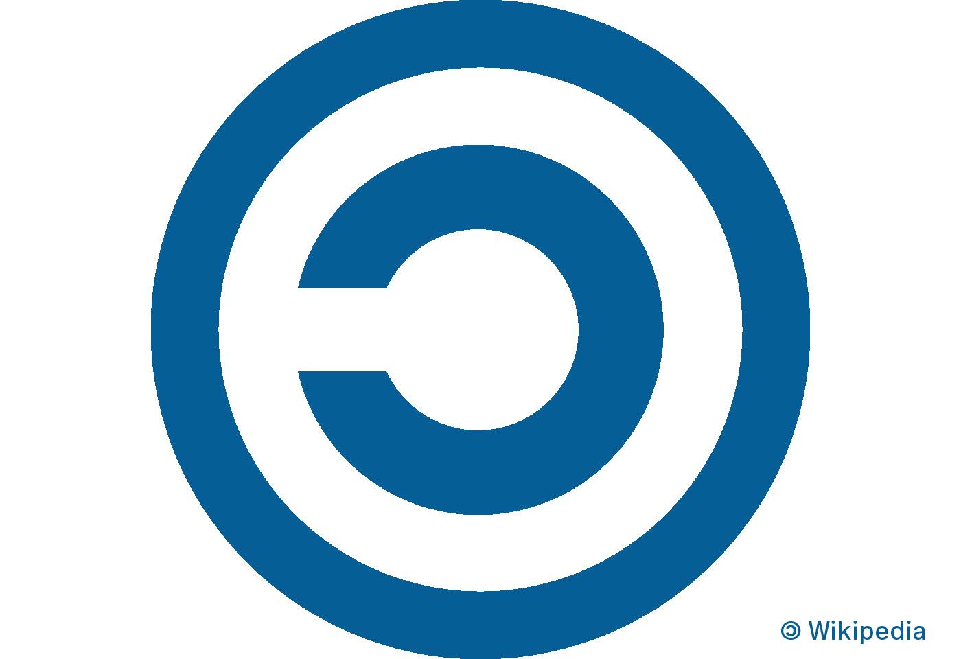
The term “copyleft” was coined by Richard Stallman in 1984/85 in the context of the GNU project. The idea behind it is to reverse traditional copyright – not to prohibit use, but to enforce it under the original conditions. Sharing vs appropriation. There is even a symbol for copyleft: a mirrored © (Unicode U+1F12F, since v. 11.0.0, June 2018). Has anyone integrated it into a font yet? Does anyone know of any fonts that contain this character?
Jürgen Siebert :CommentTypo: boosted:

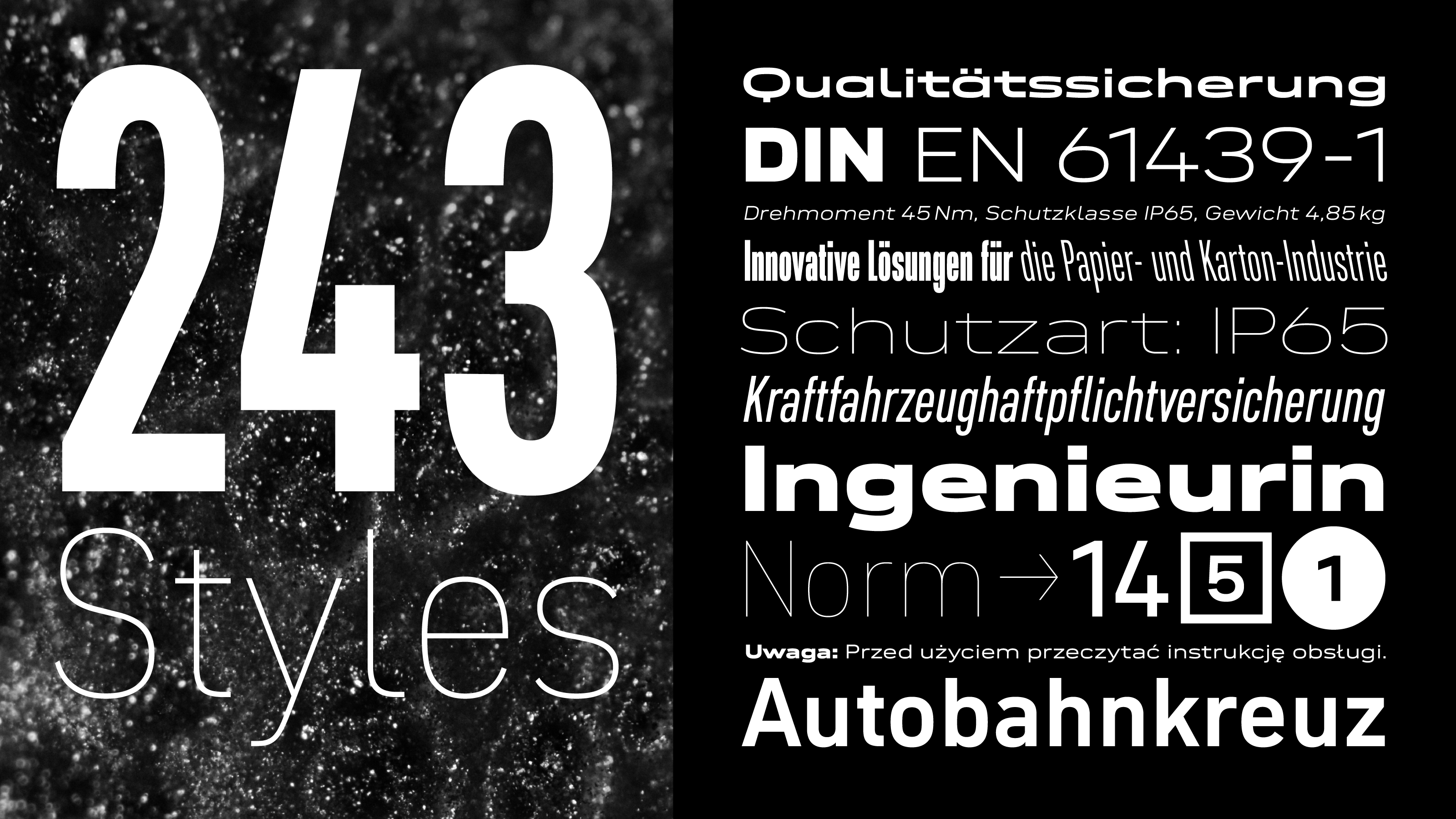
Neue DIN breaks new ground again with Italic & Retalic.
Despite the large size of Neue DIN, italics were missing. Not only because we wanted to design them with care, we also wanted to break new ground when it comes to something natural as italics. So we added not ‘only’ the 81 normal oblique fonts, but also the same number of backslanted variants. These Retalics offer novel possibilities in display contexts, for example.
This update increases the number of static fonts to a whopping 243. For those who prefer a more manageable approach, the variable font has been given a third axis for slanting in both directions. This one is especially fun. Try it out for yourself: https://fontwerk.com/fonts/neue-din


@koeberlin @gabrowitsch Wäre eine x-beliebige Schrift zitiert worden, hätte ich das Ratespiel nich aufgesetzt. :)
@gerritvanaaken 29. 10. 2024: „Straßenbahn entgleist und kracht in Apple-Shop” https://m.bild.de/news/ausland/vier-verletzte-in-oslo-strassenbahn-entgleist-und-kracht-in-apple-shop-6720c823b54ff317ce96a180
The answer is FF Mark. cc @koeberlin @gabrowitsch @hvdfonts

[2/2] Possible answers:
[1/2] On pages 60/61 of this German novel:
”As with the website and all brochures, the cool yet elegant font ██████ had been abandoned and replaced with a cursive typeface that gave Munk & Partners’ appearance the look and feel of a wine label.“

Jürgen Siebert :CommentTypo: boosted:

Viele Politiker kritisieren Elon Musk und X als Plattform für Hass, Desinformation und Radikalisierung – und äußern diese Kritik ausgerechnet dort. Damit stabilisieren sie Reichweite, Relevanz und Geschäftsmodell genau jener Plattform, die sie angeblich ablehnen. Wer X nutzt, füttert den Algorithmus mit Aufmerksamkeit. Konsequente Kritik hieße: X verlassen und Kommunikation dorthin verlagern, wo Debatten nicht durch Empörung monetarisiert werden.
@marcthiele Great New Year’s statement, Marc. Thanks.
@koeberlin Großartiges Schriften-Marketing. Bin jetzt #werder Fan #svw 🤣
@vowe Weil es in Deutschland erst seit 2025 eine breite Mehrheit für/gegen beides gibt?
@typographica @mwichary Unfortunately, there is no explanation of how the bulletin board system (BBS) worked. What hardware was used as the basis?
@mwichary @dnlutz To answer your question about the fast delivery of fonts:
At FontShop in Berlin (est 1989), we began distributing CD-ROMs with encrypted fonts from Adobe, Agfa, and Monotype in 1991. To unlock a font, we sold our customers codes that were transmitted by fax or telephone.
Starting in 1993, we delivered font files—called "advance delivery" for legal reasons—via ISDN over the telephone network; the package containing the diskette reached customers 1-2 days later.
In 1997we launched fontshop.de with a download page for trial software. Online-shopping w/ direct download followed 5-7 y later.

Client Info
Server: https://mastodon.social
Version: 2025.07
Repository: https://github.com/cyevgeniy/lmst